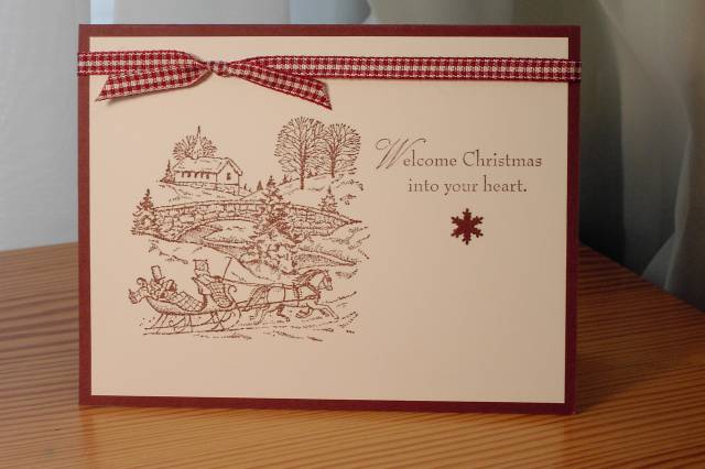
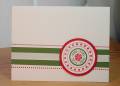
Here's an example of a card that ALMOST works, lol! There's just something unbalanced about it, and I added the punched snowflake to fix it, but it just doesn't work.
Any suggestions for a fix, here?
Date: Saturday, October 27, 2007 GMT Views: 2654
Favorited:27
Registered: August 21, 2007 Location: Wayland MA Posts: 105090
Sat, Oct 27, 2007 @ 10:57 AM
Have you thought about moving the knotted ribbon to the right and adding another snowflake under the first? It might balance that way. Even if yuo did nothing, I like it's simplicity. Anne.
------------------------------ Anne HarmonFS154, QFTD58, PROUD FAN CLUB MEMBER (photo of our Great Granddaughter Elise, just 6 months old) and me, even older.
Registered: September 9, 2004 Location: Casa Grande, AZ Posts: 741
Sat, Oct 27, 2007 @ 11:02 AM
I think perhaps moving the sentiment down towards down towards the horse and then having 3 of the little snowflakes between the top of the sentiment and ribbon.
Registered: July 28, 2005 Location: Katy, TX Posts: 187
Sat, Oct 27, 2007 @ 11:05 AM
I agree with jdmommy that the simplicity of the card is very eye-catching (and with moving the ribbon knot to the right). I think it would be more balanced if you lowered the sentiment to more like the middle or even the bottom of the page (maybe with the punched flake above it?) Anyway this is a really great start for a card - I'm sure once you play with it a little, you will come up with something you really like.
Registered: January 19, 2006 Location: Illinois Posts: 931
Sat, Oct 27, 2007 @ 11:24 AM
How about changing the direction of the card, portrait rather than landscape. Leave the ribbon. Put the drawing on the top, phrase on the bottom...just a thought.
------------------------------ ~Carol
*avatar* Can I make your wish come true?[FONT="Fixedsys"][/
Isaiah 40:31
Maybe 2 more snowflakes below the first one OR how about just a smidgen of irridescent ice mixed with red fine glitter stippled around. A smidgen leaves just a suggestion of glowing snow...although I like it just the way it is too. Have a Happy....
Registered: March 11, 2007 Location: Woodsy Pennsylvania Posts: 131
Sat, Oct 27, 2007 @ 12:46 PM
Maybe try turning the lower right corner up to show a little of the red under neath. It is a very pretty simplistic card . I'm sure you'll figure out what it needs to make it work for you. TFS
Registered: April 18, 2004 Location: Moving home to Kiwiland sometime soon, I hope! Halifax, Nova Scotia, Canada until then. Posts: 714
Sat, Nov 03, 2007 @ 11:58 AM
I would move the knot to the middle, and lower the greeting to the middle too. Then it will be more balanced, but it's a beautiful card to start with, anyway!
------------------------------ "Bother," said Pooh, "Eeyore, ready two photon torpedoes and lock phasers on the Heffalump. Piglet, meet me in transporter room three. Christopher Robin, you have the bridge." My Gallery
Registered: July 26, 2005 Location: Back in Oregon! Posts: 18199
Sat, Nov 10, 2007 @ 8:55 AM
I love the simplicity of the burgundy and white! I agree with those who suggested moving the sentiment down, but it's a lovely card just as it is, too!
Registered: September 2, 2004 Location: state of confusion Posts: 3060
Sat, Nov 10, 2007 @ 2:06 PM
I agree with whoever thought of completely changing the orientation to vertical instead of horizontal, with the image on top and the greeting below and the ribbon on the side.
Registered: May 21, 2007 Location: North Western Vermont Posts: 13
Sat, Jul 26, 2008 @ 4:03 PM
Try doing this one as a left side fold. Put your stamped elements in a verticle line. Either the pic, the star and the verse on the bottom or the verse on top, the star and then the pic on the bottom. You could still keep the ribbon, just put the knot closer to the top. It's the white space that's throwng it off in this setup. Nice card though!