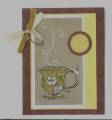
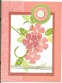
The colour looks much better on the real card. I used apricot appeal but it looks so yellow when I scanned it. The tea cup is chalked with mustard and banana (b/c I didn't have apricot chalk), but it looks like apricot on the Kraft paper. I used clear ep and the white gel pen on both the cup and the steam (Doodle this). I cut the edges off the narrow twill tape to frey it. I also pulled the taupe grosgrain edge to frey it. I distressed the Kraft with scissors.
any suggestions how to scan more true to colour?
TFL
Date: Tuesday, April 17, 2007 GMT Views: 371
Favorited:8
Additional Info
Stamps: Doodle This, linen bg, Print Pattern bg,
Paper: APRICOT, Kraft, Bravo Burgundy
Ink: Baroque Burgundy, Versa Mark
Accessories: white gel pen, versamark pen, mat pack, SU hardware
Splitcoast Artist in Residence Splitcoast Dirty Dozen Alumni Mix-Ability Challenge Hostess
Registered: October 19, 2004 Location: Warsaw, MO Posts: 16999
Wed, Apr 18, 2007 @ 7:17 AM
I love this! I'll have to try that color combo. Love the doodle steam, and the teacup...I have the teapot that goes with it - wanna come over and play?!