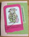
Well, the image is pretty but I'm not too thrilled with the way this one turned out. It's missing something...or maybe the colors don't work that well...what do you think? TFL.
Date: Sunday, March 18, 2007 GMT Views: 187
Favorited:2
Registered: April 25, 2006 Location: Toronto, Ontario Posts: 10868
Mon, Mar 19, 2007 @ 5:41 AM
I really like this card - the image is very light and breezy. The colours work well, too. My only suggestion (I never know if I should do this, but you did ask!!) is that maybe the brown border is too wide and weighs the image down a bit? If it were narrower, maybe the whole card would feel a bit lighter, which would be in perfect harmony with the feeling of the image? I think you did a great job colouring the image!
------------------------------ Come visit my blog, MASKerade
Registered: June 24, 2003 Location: Ontario Posts: 5126
Mon, Mar 19, 2007 @ 6:14 AM
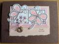
I would suggest simply expanding the blush background the butterflies are mounted on then it would be PERFECT!!!!
However even just the way it is, It is very pretty already though.!!! ;) TFS!
------------------------------ ~Tracey it is what I am that matters to God; not what I was Take a peek...