Registered: July 31, 2005 Location: Colorado Springs Posts: 791
Thu, Mar 15, 2007 @ 8:36 AM
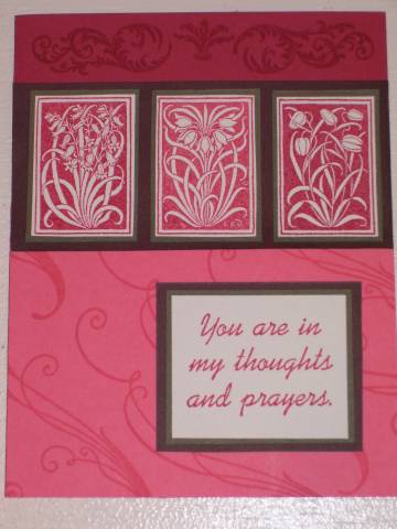
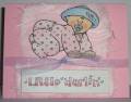
I agree a small ribbon on the bottom 1/3 would perk it up. I also might have chanded the writing card to white ink on red. Just a thought. Love the design and love the stamps. Good work!
Registered: June 13, 2006 Location: Glen Allen, VA Posts: 691
Thu, Mar 15, 2007 @ 8:52 AM
I would like it better if the top portion of your card was the same coral color as the bottom. The red is too dark and 'heavy' to be at the top. JMO...
Still nice card though
Registered: August 25, 2005 Location: Southeastern PA Posts: 9850
Thu, Mar 15, 2007 @ 4:51 PM
do a little direct ink to paper on the word sqare. use a spiral clip with a small piece of ribbon tied to it on the square. Or a brad on the top right corner of the word square.
Registered: November 16, 2004 Location: North woods of Wisconsin Posts: 1756
Fri, Mar 16, 2007 @ 6:51 AM
I agree to bring the coral to the top--maybe a red panel only 1/4" on top and bottom of the three images. And I would put the sentiment inside the card, and use a smaller word(s) on a tag maybe clipped or tied to the main images panel.
------------------------------ Lauri G.
Blessed wife and mom
TAC demo #2239
Registered: March 27, 2007 Location: Fargo, ND Posts: 13751
Thu, May 24, 2007 @ 6:23 AM
I read the suggestions, and yes, usually I would also say the darker color on the bottom because it's "heavier." But, I'm guessing this is a sympathy card, or could be, and I think the "heaviness" of it maybe adds a somber tone that is totally appropriate! I think this card is gorgeous. I wouldn't add ribbon - a cheery touch that might seem frivolous. Those stamps are absolutely beautiful. Maybe all I would do is put the triple images in the lower half and the sentiment at the top - offset to one side, but partially over the rosy color, mostly on the darker color. But really, I think it's just lovely!!