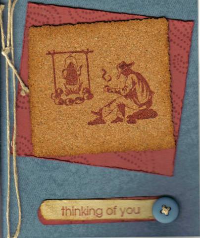
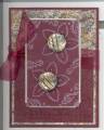
I liked the Buckaroo Blue and the Cranberry Crisp so well (and I had an extra square already stamped with the paisley), so I decided to do another card with it.
I've had this cork FOREVER and never used it. So I figured I would find a way. I like the way the Distress Ink looks on the edges of the cork- very worn, almost slightly burned kind of look. It really stamps nicely, too.
This cowboy stamp saw ink for the first time today, also. I like the image so much, but always felt stumped for how to use it.
I wanted a "Thinking of You" card that was also masculine (seems I have needed several lately & never have one that seems right). I was tempted to use a "What's Brewing" stamp, but decided to just do "Thinking of You" for today.
The button was a stretch for me, but such a perfect match to the paper.
Date: Friday, January 12, 2007 GMT Views: 738
Favorited:2
Registered: November 27, 2004 Location: Ottawa, Ontario CANADA Posts: 248
Fri, Jan 12, 2007 @ 5:04 PM
What a great card! I love the way you used the cork. It lets the image be the focus, while giving it a very unique feel.
TFS
------------------------------ "We look forward to the day when the power of love will replace the love of power. Only then will we know the blessings of peace"
Registered: June 13, 2005 Location: newly relocated to beautiful Kamloops, BC Posts: 2001
Mon, Jan 15, 2007 @ 7:28 AM
great job - looks awsome!
------------------------------ There is an 18 year gap between my daughter and my son... we wanted to make sure the first turned out, before trying for the second!!!