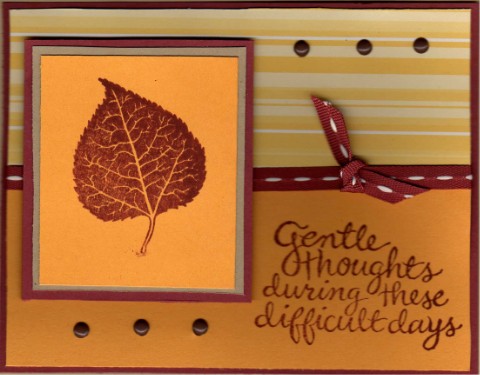
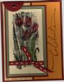
my scanner makes the main image color brighter than the rest...in real life, everything matches......anyway....trying to get some generic cards done with the color challenge
Date: Tuesday, December 5, 2006 GMT Views: 513
Favorited:11
Splitcoast Dirty Dozen Alumni Splitcoast Gallery Moderator
Registered: July 19, 2004 Location: Colorado Posts: 24169
Tue, Dec 05, 2006 @ 10:06 AM
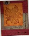
Very pretty. I like the striped paper and the orientation works well for a sympathy card. (How come I never think to put the stripes longways?) The brads are perfect for balance.