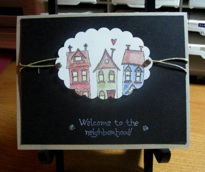
I'm trying to work with this set to come up with cards for the Welcome Basket given to new neighbors in my sub-division. I am struggling to come up with something I like. Thank you for your comments and suggestions! I'll be going back to the drawing board on this one and hope to find success now that I'm armed with such great suggestions!
Date: Thursday, August 24, 2006 GMT Views: 1468
Favorited:8
Registered: September 1, 2005 Location: Michigan Posts: 1129
Fri, Aug 25, 2006 @ 12:21 PM
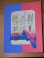
I like it but it could use something more, maybe something stamped on the black card. Or a mat for the houses.
------------------------------ Kathi S. I really should go to my craft area and create but I'm always on SCS.Copic Addict: 205 and growingCrafting = OCD
Registered: February 16, 2005 Location: Elgin, IL Posts: 4489
Fri, Aug 25, 2006 @ 12:32 PM
Request for constructive criticizm; I feel too like something is missing... perhaps it is just the bottom of the houses.... I don't feel like the oval scallop works. Perhaps just a rectangle matted... showing all of the houses... with the same cute ellement of the brads and hemp (I like that a lot) would be better. I love the Watercoloring... great job there. I would also loose the stickles dots... or maybe use the stickles on the houses... the flowers in the RAH focal point....
Registered: December 22, 2004 Location: in the nuthouse! Posts: 787
Fri, Aug 25, 2006 @ 1:20 PM
Well, for my own 2 cents I guess I'll be in the minority - I like the scalloped edge of the houses! I've been eyeing this set for some time and I feel like I always see rectangle or square, multi-layered mats for cards using this set. This card stands out to me because you tried something different (not that I don't like the other cards because they use the recatangle/square mats, mind you. It's just nice to see something different.) I say "Keep it!" I'd love to receive a card like this! Great Job!
Registered: June 7, 2004 Location: Hotlanta Posts: 2090
Fri, Aug 25, 2006 @ 3:42 PM
I actually am in the minority too. I like this card. I have a lot of samples under my gallery of this set as I make these type of cards for my realtor. I have a hard time coming up with samples but I like this. I think it is simple, yet elegant.
Registered: December 8, 2004 Location: Posts: 21809
Fri, Aug 25, 2006 @ 7:23 PM
Thanks so much for the helpful comments! I really appreciate all of the suggestions. I'm going back to the drawing ...er, stamping board tomorrow to put your suggestions to use! I'll post what I come up with! Thanks again - so good to know I have cyber friends to lean on and rely on when I really need some help in the creative process!!
Registered: July 18, 2004 Location: Poulsbo, WA Posts: 5747
Fri, Aug 25, 2006 @ 7:55 PM
I am thinking the white of the image clashes with the kraft of the card. they would look better with both white. I agree with a rectangular image and a colored mat.
------------------------------ ~Vee
It's not who you know-it's whom you know.
Registered: June 13, 2004 Location: Oil...Hot Pan...Gordon Ramsay sexiest man alive...Done. Posts: 9753
Fri, Aug 25, 2006 @ 8:04 PM
I think I would turn the card so it is portrait (including the scallop punch) then stamp the houses so that the middle house images is complete (it's OK for the others to be partial)...I think I would use a warmer color than black...(just seems cold for a card that should be 'welcoming...) the kraft is great...maybe Ruby Red or somethng similar to replace the black. I like the hemp, but I would layer it over either ribbon or twill tape (again adding warmth).
You are definately off to a great start...and what a nice thing to do for your new neighbors! Make sure to post your updated version so we can all see it!
Registered: June 27, 2005 Location: Crossfield, AB Posts: 3239
Mon, Aug 28, 2006 @ 9:20 AM
I agree with matting the image. I like the scalloped edges, but a rectangle would be easier to mat and mass produce. I also think the houses are too cropped - would like to see at least the full center house. But, really, I love your card. It's quite striking! I think it's an excellent card for the welcome wagon basket!
Registered: September 12, 2005 Location: Niskayuna, NY Posts: 400
Mon, Aug 28, 2006 @ 10:20 AM
I also think the black is too severe. I like the scalloped edge. How about putting it on top of an oval mat, color to match one of the houses. Match that mat with the card color, and pick another color from the houses to replace the black. Texture that color with a backgroun or wheel. JMO, Pam


 Great Job!