Registered: October 21, 2004 Location: Right outside KC MO Posts: 1688
Mon, Aug 07, 2006 @ 2:52 PM
I wouldn't change a thing. I was drawn by it's beauty and can't believe you want to change it. lol! Very pretty!
------------------------------ ~*Becky*~ *My Gallery* Save the earth. It's the only planet with chocolate. � Just because someone doesn't love you the way you want them to, doesn't mean they don't love you with all they have.
Registered: June 7, 2006 Location: Utah Posts: 2194
Mon, Aug 07, 2006 @ 3:10 PM
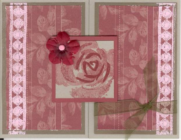
If isn't a bad card,it has a pretty look, but if it were mine I would change the trimtastic from pink to a metallic, something that would blend with the sand background of the center image. Like silver or brass color. Even a brown or gold embossed would do it, or a dark red embossing would be nice too. It would make it seem richer, I would then change the pink brad to match the trim. So for me, no pink .
Registered: June 19, 2004 Location: Kent, WA Posts: 21196
Mon, Aug 07, 2006 @ 3:19 PM
I think it is beautiful the way it is! I love the colors you chose. If you are looking to add more contrast, I agree that matting the rose on green would help pull it out more. If you don't do that, I think I would use a different color ribbon. Perhaps white or pink.
Registered: November 29, 2005 Location: In the State of Stamping.... or NC Posts: 15140
Mon, Aug 07, 2006 @ 3:35 PM
I like it! If I would change anything I would use a different green like maybe old olive. But they may have requested these colors and papers. I agree that changing the brad to a metallic color would look even better.
Registered: March 9, 2005 Location: Farmington, NY Posts: 4614
Mon, Aug 07, 2006 @ 3:36 PM
Is this a gatefold card? It's a little hard to tell in the pic, but I'm going on the assumption that it is. First of all, I love the colors! It's very elegant and I like the ribbon and the prima flower. Try embossing the trim on just the patterned paper, not overlapping onto the cardstock. Also you could add one or two layers under the rose, to match the rest of the card. I'm not sure how complicated you want this to be, so I hesitate to add anymore suggestions. With my own cards, I find that I like to add and add but in a class, it might get overwhelming for the students. ;) That said, you could try a background stamp, like Linen or Canvas, on the Sahara Sand layer in Sahara Sand, or Versamark. These are just suggestions; I think the card is beautiful the way it is.
Registered: September 10, 2004 Location: Cedar Park, Tx Posts: 50356
Mon, Aug 07, 2006 @ 3:58 PM
I like this card , the only thing I would/might change would be to put a darker brown layer behind the central image to make it pop more, maybe a tag off the central image on the upper right side edge like a single word(done like a levis tag or something). It is a lovely card
Splitcoast Dirty Dozen Alumni Creative Crew SU Design Team Alumni
Registered: July 7, 2004 Location: Newton, MA Posts: 7218
Mon, Aug 07, 2006 @ 4:05 PM
Beautiful card. I love the colors. I think the only thing that it is missing is a more defined focal point. The rose in the center needs to stand out a bit more so the eye knows where to look. I think the suggestions on matting it might help.
Like Karen, I would double mount the central image with the Thyme to help it pop, or maybe triple mat with a pink to match the embossed Trimtastic... you know, pull all the colors together while keeping the cental image the focus.
Registered: January 14, 2005 Location: Posts: 7516
Mon, Aug 07, 2006 @ 5:00 PM
Very pretty! I agree that putting the Thyme behing the central image would be great too. And I would put th eprina over the knot in the ribbon so it doesn't detract from the rose.
Registered: January 26, 2005 Location: I'm seeing spots!!! Posts: 15188
Tue, Aug 08, 2006 @ 5:54 AM
Cyndi, It's a lovely card! I agree with just stamping the trim on the top layer,not letting it go over on the bottom layers. I think I would try the background as pink or white...it's hard to tell in the scan with colors sometimes, but I'm not sure about the sahara sand. I love the layout!
------------------------------ �.��* .��*��)) -:�:- ((��.��*~Beth.��*��)) -:�:- �� ((��.��* .��*((��.�.�� *-:�:- ... I'm always up to Something...
Registered: November 6, 2004 Location: South Dakota Posts: 23930
Tue, Aug 08, 2006 @ 5:56 AM
I think this is very beautiful!
If I were to change anything, I'd perhaps triple mat the rose. I'd maybe add the sahara or even a silver piece of cs and then layer with the green. You could even put some stickles or gelly roll pen over the rose to bring the eye to the center.
------------------------------ Kimberly My Gallery


 .
.