This card almost drove me crazy! I know, short trip! What easier colors and sketch could there be?
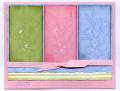
I guess the problem was trying to make my colors right. How hard can that be? Let me tell you... First of all, my new colors haven't arrived yet. I had to use Bashful Blue. I stamped the flowers on the colored cs in the same ink. It was plain so I sponged the edges with the same color ink. When I got to the bashful blue piece it looked too dark. I realized I had sponged on bordering blue instead. Oops! The only way to fix it was to use regal rose on the pink and almost artichoke on the celery. I also stamped each panel in Linen BG in Celery, Pretty in Pink and Bashful Blue. Now what color to use for the bg piece and what stamp to use. I chose bashful blue and Floral. The white piece with celery sponged on is crimped. Now things got smoother, thank goodness! I used pretty in pink for the card with weathered bg and "happy" in stamped in bashful. The word is actually from a stamp that says Happy St. Patricks Day, from the retired set, More Great Greetings. Now that you know the story, Thanks for Looking. (I still haven't decided if I like it or not.)
Date: Wednesday, July 26, 2006 GMT Views: 1070
Favorited:12