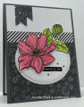
My card for the Color Challenge hosted by Chris. Her lovely color selection is Lost Lagoon, Wild Wheat and Pebbled Path. The dessert option is add a border.
This card was the first time I have used the Wild Wheat ink. It is an interesting color; I look forward to seeing what everyone makes. I stamped the bouquet in the Wild Wheat and stamped the flowers on top & a bow in the Lost Lagoon.
I had a scrap of Lost Lagoon that had been previously stamped tone-on-tone with a lace background. It was a perfect piece to add a border to the top panel. The two were layered on a piece of DSP with a hint of Pebbled Path and then onto a Pebbled Path card base. Final touch was to lightly add Wink of Stella on the bow & flowers and place a Pebbled Path dot on the bow.
We hope you will explore your creativity with these colors and share with us what you create. Have fun! TFL
Date: Monday, October 9, 2023 GMT Views: 664
Favorited:5
Registered: February 19, 2011 Location: Fullerton, CA Posts: 15293
Mon, Oct 09, 2023 @ 7:20 PM
Wow, Diane. You used these colors brilliantly. The whole design has such a tranquil feel -- perfect for your sentiment. Your coloring is phenomenal, especially on the bow. The translucence is fabulous. Awesome card.
Registered: August 9, 2006 Location: Central Oregon Posts: 2092
Mon, Oct 09, 2023 @ 8:12 PM
Oh, I LOVE your card!! Suh a pretty stamp and I love it in the Wild Wheat color and Lagoon! All your layers look so perfect together. Great take on this color challenge!
Splitcoast Dirty Dozen Creative Crew SU Design Team Alumni
Registered: January 7, 2007 Location: Southern California Posts: 42913
Mon, Oct 09, 2023 @ 8:44 PM
I really love this image and I still have it in my collection. Thank you for showing me new ways to use it. I love your patterned borders to highlight the focal point.
------------------------------ Kathy Stamp n Sip with me
Splitcoast Dirty Dozen Creative Crew SU Design Team Alumni Splitcoast Challenge Hostess
Registered: November 28, 2004 Location: St. Paul, Minnesota Posts: 11240
Mon, Oct 09, 2023 @ 9:00 PM
This is beautiful, Diane! That set always made fall seem so delicate and pretty. You lovey card shows how perfect it is for these colors. I think I know what you mean by the ink. I keep thinking that my pad is too juicy but it matches the paper perfectly. I've used the Blends and since I always start with the light one I think I tend to think of that as the true color.
Registered: August 21, 2007 Location: Wayland MA Posts: 105272
Tue, Oct 10, 2023 @ 10:06 AM
BEautiful! Love the frame.
------------------------------ Anne HarmonFS154, QFTD58, PROUD FAN CLUB MEMBER (photo of our Great Granddaughter Elise, just 6 months old) and me, even older.