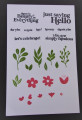
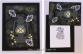
So, after picking out this label from my stash (woohoo!) it came together easily.
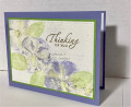
I first tried using copper EP for my sentiment on the Espresso CS, but, it didn't have enough contrast and just got kinda lost.
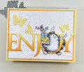
I cut my ribbon in half and it had some stray fibers hanging off afterwards. So, I tried pulling them and it left this tiny little clear border. I thot it was cool looking.
Date: Tuesday, October 3, 2023 GMT Views: 217
Favorited:1
Registered: June 4, 2009 Location: Deatsville, Alabama Posts: 83521
Sun, Oct 08, 2023 @ 5:25 PM
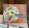
Such pretty flowers and colors, Michelle. A stunning card. Hugz
------------------------------ Nancy Williams - Hope your day is Spirit-filled and ink-filled (in that order)!DRS Designs-DT, Punchkateerforever, Dirty Dozen Alumni
Registered: January 20, 2010 Location: Brampton, Ontario Posts: 26138
Mon, Oct 16, 2023 @ 9:52 AM
Your copper accents and speckled dots really add a touch of sparkle to your card. Your beautifully coloured image of sweet flowers is supported perfectly with that pretty die cut layer. What a great design! TFS
Jeremiah 29:11 Splitcoast Dirty Dozen Alumni | Proud FanClub member since 2017
My Gallery | My Blog "The wind of Heaven is that which blows between a horse's ears."