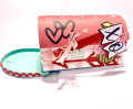
I love Karen's colors this week! They are one of my favorite combinations - turquoise and yellow. When I decided to use this die for a birthday card for a friend's 80th birthday, I hit pay dirt with her dessert of anything goes! I added the Poppy Parade to give it a punch of contrast and I also added the Bermuda Bay as a shadow to the Coastal Cabana (I always thought of those two colors as shades of the same.)
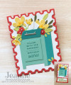
This card was fun to put together. I cut a bunch of flowers and then started arranging. I have several leftover so I'll make another card.
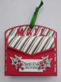
I usually don't mix companies (I have no idea why) but in this case the Stamp Fold-It made a perfect backdrop for the mailbox. I turned it into an easel for easy display.
I hope you will join us this week. I'm going to love seeing these colors in the gallery!
Date: Monday, October 2, 2023 GMT Views: 283
Favorited:1
Splitcoast Dirty Dozen Alumni Splitcoast Challenge Hostess The Charmed Life
Registered: November 19, 2005 Location: Bethel Park, Pa Posts: 37249
Mon, Oct 02, 2023 @ 8:28 PM
I love this easel card and the stamp fold-it makes it a standout with the mailbox die. I bought this die and have been waiting for the right colors to use it. Pairing the coastal and bermuda is perfect- wish I had thought of that (lol)!!! Your friend will love this card.
------------------------------ Mary Marsh SCS Color Challenge DT Coordinator My Blog- The Charmed Life
Splitcoast Dirty Dozen Splitcoast Challenge Hostess Proud Fan Club Member
Registered: September 24, 2007 Location: WA Posts: 13991
Mon, Oct 02, 2023 @ 11:00 PM
Jeanne, your friend is going to adore this wonderful card! I love the depth you created with Bermuda Bay and Coastal Cabana. The flowers are beautiful! Wow!
------------------------------ Barbara Splitcoast Dirty Dozen My website: Inky Fun SCS Fan Club Member Color Challenge Team Member QFTD215
Registered: February 19, 2011 Location: Fullerton, CA Posts: 15293
Tue, Oct 03, 2023 @ 1:14 AM
This card is just overflowing with happy wishes and your friend will definitely feel the love. I, too, love the contrast you created with the two blues and I also adore that pop of color from the poppy parade. It added just the right amount of contrast and zing. Fabulous card.
Jeremiah 29:11 Splitcoast Dirty Dozen Alumni | Proud FanClub member since 2017
My Gallery | My Blog "The wind of Heaven is that which blows between a horse's ears."
Registered: October 12, 2007 Location: Arizona Posts: 70680
Tue, Oct 03, 2023 @ 10:49 AM
Wow, super mailbox! Wonderful inspiration for the challenge colors.
Love the flowers coming out and the letter going in. So cute & fun! The easel design is fabulous. Love the postage stamp edge.