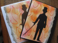
Anne, I'm not sure why you think either of your cards need retweaking. I like them both very much and would not have given your flame position a second thought. Great case.
Registered: February 19, 2011 Location: Fullerton, CA Posts: 15011
Sun, Jul 09, 2023 @ 8:24 AM
Well, I have to admit I do like the tear on the right side better and I especially like the black layer better. Both look good, but I am definitely more partial to the black. And, as Kittie as said, they both look great as is; but, since I'm a layer girl, I might try to add a sentiment or die cut sentiment for one more layer. I thought of "ouch" but that's too silly for this. IF you decide it needs one more thing though, I'm sure your creative mind will figure out something better than that. Or, you can just stay CAS and let the flames do the talking.
These are both great, Anne, but I think I prefer the one with the black surround! It gives more pop! Your inking of the embossed flame BG is perfect! I'm with Julia, wondering what your inside sentiment is!!!
Registered: June 4, 2009 Location: Deatsville, Alabama Posts: 82526
Mon, Jul 10, 2023 @ 4:09 AM
Love them! I know you will think of the best sentiment for the inside that will make these the coolest cards ever (or the hottest? lol). I wouldn't add anything to them. Hugz
------------------------------ Nancy Williams - Hope your day is Spirit-filled and ink-filled (in that order)!DRS Designs-DT, Punchkateerforever, Dirty Dozen Alumni
Registered: November 3, 2005 Location: Fairport Harbor, OH-IO, Lake Erie shoreline Posts: 60073
Mon, Jul 10, 2023 @ 4:23 AM
There is NOTHING wrong with either of these mdf. I would not do a thing to either. And, as Nancy says, you will think of the coolest inside greeting. Do Not Touch either of these!!
------------------------------ Karen ~ Thanks for stopping by my gallery. Proud Fan Club Member - FS525, QFTD49 Life is better in a beach town!