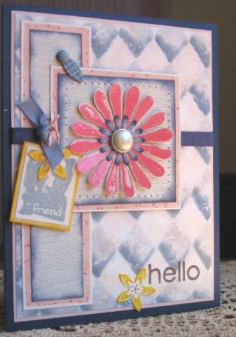
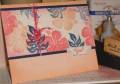
Colors courtesy of this week's color challenge. I stamped the flower in Regal Rose Craft and clear embossed it. I would have liked to use a little more Regal Rose, but the Craft color is just a bit off. I added the Summer Sun to try to perk it up but I'm not sure it helped much. To make the Print Pattern background, I sponged Blush Blossom on Whisper White, then stamped with Versamark, shaded with Stampin' Pastels and sprayed with matte sealer.
Date: Saturday, July 1, 2006 GMT Views: 1524
Favorited:56
Paper: Night of Navy, Blush Blossom, Barely Banana, Whisper White, Very Vanilla
Ink: Bordering Blue, Night of Navy, Regal Rose Craft and Classic, Blush Blossom, Summer Sun, Versamark, StazOn
Accessories: Navy and French Blue grosgrain ribbon, fiber, clear EP, Spring flower punch, La Boutique brad, Stampin' Pastels, mat pack, white gel pen, spray matte sealer, photo turn and brad
Splitcoast Dirty Dozen Alumni Creative Crew SU Design Team Alumni
Registered: October 29, 2004 Location: Coos Bay, Oregon Posts: 24007
Sat, Jul 01, 2006 @ 11:29 PM
Lucky, lucky me.......I got to see Leslie's beautiful card IRL. You just can't believe how soft and all the shading texture in the Print Pattern BG. So creative and so Leslie. I like the added summer sun. TFS
Registered: February 24, 2005 Location: East Coast Posts: 1843
Sun, Jul 02, 2006 @ 3:37 AM
Very pretty - love the softness of the colors and all the elements and layers!
------------------------------ Leeci ------------------------------------------------------------------- God sometimes lets life turn you upside down so you can learn to live right side up.
Registered: March 18, 2004 Location: New Hampshire Posts: 7021
Sun, Jul 02, 2006 @ 4:47 AM
Love what you did with Print Pattern! I'll definitely try it.
------------------------------ "Life is much too important to be taken seriously." Oscar Wilde Proud to be a member of Mo's Digital Pencil Challenge DT! My BlogMy Gallery
Registered: July 11, 2004 Location: Troy, Michigan Posts: 10374
Sun, Jul 02, 2006 @ 4:58 AM
Wonderful effect with the chalks on that Print Pattern - so dimensional! I love the stitching around the focal flower, and is that Canvas stamped on the photo turn? Of course, I love that pearl brad! :o) The yellow is definitely a nice contrasting touch. Lovely design, as always. TFS. Linda
------------------------------ Linda Art is the only way to run away without leaving home. -Twyla Tharp