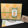
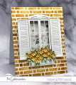
Karen is our hostess in the Color Challenge this week, and she asked us to use very, very soft pastels: Blushing Bride, Very Vanilla and Soft Sea Foam. The dessert option is "favorite bling." Does the gold count as bling? It's pretty shiny!
I guess I was feeling a little rebellious this week. It's still cold and wet in the Seattle area, and I just had to add some "character" to these pretty pastels. So although I used the cardstock from the challenge, I brushed Mossy Meadow and Merry Merlot inks (neutrals) liberally onto my die-cuts.
To get my letters lined up, I used a little trick--well, two of them. First, I applied Stick-It to the back of the gold foil cardstock before cutting the letters. Then I used the background as a template when applying the letters. I taped it down with removable tape, peeled the Stick-It backing off of each letter, and placed it down into its space. When I was done, I carefully lifted up the background, leaving the letters in place.
I glued everthing down, and popped up the three big flowers with Dimensionals.
I'm predicting some beautiful, soft cards in the gallery this week to welcome spring, and maybe even one or two baby girl cards. Please join in the fun and show us your creations.
Splitcoast Dirty Dozen Alumni Splitcoast Challenge Hostess The Charmed Life
Registered: November 19, 2005 Location: Bethel Park, Pa Posts: 37195
Mon, Apr 17, 2023 @ 7:30 PM
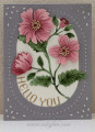
The flowers are really pretty I never thought to use merry merlot to add some contrast- creative. And the letters are lined up perfectly. I like your layout and the punch & pierce plate is a great add-on to your layout.
------------------------------ Mary Marsh SCS Color Challenge DT Coordinator My Blog- The Charmed Life
Splitcoast Dirty Dozen Creative Crew SU Design Team Alumni Splitcoast Challenge Hostess
Registered: November 28, 2004 Location: St. Paul, Minnesota Posts: 11239
Tue, Apr 18, 2023 @ 5:12 AM
Amazing card, Barbara. I agree that the elegance of your oval panel really benefits from a bit more richness in color and, of course, your gold bling is perfection.
Registered: October 12, 2007 Location: Arizona Posts: 70389
Tue, Apr 18, 2023 @ 6:22 AM
Awesome design for this week's challenge colors, Barbara. Love your idea to mix in the neutrals for more depth. The Smokey Slate frame is beautiful. I like how you added the letters along the curve for the sentiment. The flowers are gorgeous. Very nicely done!
Registered: August 21, 2007 Location: Wayland MA Posts: 105226
Tue, Apr 18, 2023 @ 6:51 AM
Pretty bg for those pretty flowers.
------------------------------ Anne HarmonFS154, QFTD58, PROUD FAN CLUB MEMBER (photo of our Great Granddaughter Elise, just 6 months old) and me, even older.
Splitcoast Dirty Dozen Creative Crew SU Design Team Alumni
Registered: May 18, 2004 Location: Southwest Michigan Posts: 37081
Tue, Apr 18, 2023 @ 10:02 AM
Oh, I really like whay you've done to liven up these flowers! They are just gorgeous and that background in gray is wonderful with the color of the flowers. Also, your curved greeting looks fantastic! Beautiful card!
------------------------------ Claudia Splitcoast Fan Club Member