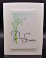
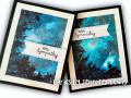
This was my kind of loose and easy WCW challenge, but there was a lot of drying time which is not my favorite. I was very patient though (fortunately I had other cards to work on). We're also discussing things we loved and things we learned in this week's challenge. I've already mentioned that I loved how easy this was, because the loose style is my kind of watercoloring. I loved how the clouds magically appeared as I added layers of paint. I would say I learned that there is a time and place for cold press paper. I generally prefer the hot press paper, but I am gradually learning when I should use cold press instead and I could tell at the beginning of this video that today was a day for it. I've also learned not to overwork my watercolor and what causes the blooms. I have some small ones here, because I'm still learning. I would also say that I learned that washi tape is not completely fool proof for masking. You'll notice that my sentiment banners are in two different places on the two different cards. One is covering the blob of color that seeped through the washi tape onto the border. The other one is covering a "bloom" in the sky. I loved splattering all the stars and I love how they came out. I skipped the shooting star, because some of my splatters are kind of long anyway. I also loved how easy the trees were--until I tried to add in the "details" of the sticks and leaves. That was too hard and I quit while I was ahead. One other note--I'm showing both cards because I'm not sure which is my favorite. The one on the left used Space Blue and I think I like the texture of the clouds better on that one. The one on the right used Azure Blue and I like the color better on that one. It's brighter. The colors look a lot more alike in the photo than in real life.
This was also a perfect challenge to use my favorite sympathy sentiment: "Perhaps they are not stars in the sky, but rather opening where our loved ones shine down to let us know they are happy."
I am so glad you included both cards in your photo. They are both gorgeous. I like how you left space in the trees for light to shine through! The colors and light in your skies are amazing! The sky on the right has an amazing patch of light. It makes me think of our last camping trip when the sky was clearing after a storm. I am glad you loved the tutorial. Thanks so much for sharing what you loved and learned!
These are both such beautiful cards!! Thank you for sharing both of them and the story. I also love that sympathy sentiment, and it would be perfect for the inside. You've convinced me to give this a try!!
Registered: July 9, 2008 Location: Stars Fell on Alabama Posts: 75034
Thu, Aug 25, 2022 @ 6:37 AM
Oh, I love both cards with such gorgeous night skies. I am with you on the loose watercoloring. It is a favorite of mine, also. I think your trees look great. I know what you mean about the Washi tape. I tried it, too, and mine came loose. I guess because with this card I use a lot of water and it loosened it. Like you, I thought I would make more of these if I ever have time. Good work, Jennifer.
------------------------------ My Blog---My Gallery---My PinterestI'm a Punchkateer! (Prez) FOREVERDirty Dozen Alumni2014 CAS Spring DT--- Inspiration Challenge Co- Hostess 12/02/17-12/28/19 Watercolor Wednesday Design Team Hebrews 13:2Brenda
Registered: June 4, 2009 Location: Deatsville, Alabama Posts: 83888
Fri, Aug 26, 2022 @ 3:28 AM
These panels work perfectly for Sympathy cards too. Wow. Love how yours came out.
I read your discussion on cold press WC paper and drying time and was very impressed at your thought process. I used regular paper and dried mine in the microwave in between. I have a ton to learn and no patience. One day I am going to learn this stuff!
Love your cards, Jen. Many hugz
------------------------------ Nancy Williams - Hope your day is Spirit-filled and ink-filled (in that order)!DRS Designs-DT, Punchkateerforever, Dirty Dozen Alumni
Splitcoast Dirty Dozen Creative Crew SU Design Team Alumni
Registered: January 7, 2007 Location: Southern California Posts: 42922
Fri, Aug 26, 2022 @ 12:35 PM
I really like your color choices for the sky. I'm leaning towards the card on the right as I think your scumbling is a bit darker with more contrast. Both are just wonderful. You are really learning about the challenges of wc- blooms, leaking around the washi. But I see none of either, so you disguised things very well. I see a lot of depth in these skies!
------------------------------ Kathy Stamp n Sip with me