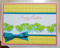
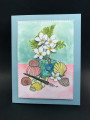
Karen is our hostess in the Color Challenge this week, and she has given us three beautiful colors with the dessert option of adding a fourth color. The colors are Pale Papaya, Flirty Flamingo and Mango Melody. For my fourth color, I pulled out a retired SU color called Cucumber Crush.
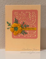
I used the Subtle embossing folder on the base of my card. It adds just a bit of interest without detracting from the die cut design. I always forget that the filigree rectangle doesn't cut around the outside of the shape, so I trimmed it with a craft knife and rounded the corners. The rest is pretty self-explanatory. I sponged a bit of Mango Melody ink on the petals for some slight color variation, and added a single rhinestone in the center of the flower.
I grew to love these colors together as I created my card. I think you will, too, and I hope to see your creations in the gallery this week!
Registered: October 12, 2007 Location: Arizona Posts: 70704
Mon, Mar 07, 2022 @ 7:44 PM
Beautiful use of the challenge colors! I saw the subtle embossing right away and thought it was wonderful texture. The filigree die-cut is so pretty. I like how the sentiment fits in it. The flower and leaves are just the right touch. Terrific inspiration!
Registered: December 3, 2013 Location: Southern California Posts: 3559
Mon, Mar 07, 2022 @ 8:13 PM
Barbara this is wonderful. I love all the texture - the embossing, the filigree and the 3D flower. It's really a CAS design but also so much more. Terrific card!
------------------------------ Jeanne My blog: spectrum-ink
Registered: June 3, 2006 Location: In my "She Shed Tornado Shelter" Posts: 4010
Tue, Mar 08, 2022 @ 7:59 AM
Simply gorgeous Barbara. The textured background looks wonderful for your delicate die cut and flower! You've used Karen's colors perfectly, sensational!
Splitcoast Dirty Dozen Creative Crew SU Design Team Alumni
Registered: May 18, 2004 Location: Southwest Michigan Posts: 37113
Wed, Mar 09, 2022 @ 7:37 AM
Just catching up on yesterday's color challenge gallery and this is really lovely! I think you have just the right balance of these three colors, leaving the mango for the least used (the card stock seems a bit bright to me). I do love this combination of colors and will surely use it again. The lacy, rounded rectangle is such an elegant backdrop for the flower and I love the subtle embossing on the card front. Faved!
------------------------------ Claudia Splitcoast Fan Club Member