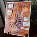
I enjoyed this challenge very much, even though I had mixed results. Acrylic paint that stayed wet for a while worked the best. I only had three colors of the Golden paints: transparent pyrrole orange, transparent red iron oxide and ultramarine violet. I really like how they mixed (I used a credit card to apply). I used the sun stencil for both the ink lift and the paste stenciled sun. I bought this effect paste on clearance at Mike's, wasn't sure it would look like, very interesting effect. It has sand and sparkle in it. I always enjoy using the Helen Keller quote. Thanks, Anita.
Date: Monday, February 22, 2021 GMT Views: 317
Favorited:2
Splitcoast Dirty Dozen Splitcoast Challenge Hostess Teapot Tuesday TEAm
Registered: June 3, 2016 Location: France Posts: 60309
Mon, Feb 22, 2021 @ 12:05 PM
Very artsy design, I love the sparkling sun and love the beautiful colors in your BG, Helen Keller was an amazing woman, I've read her book and I admire her!!
Splitcoast Dirty Dozen Splitcoast Challenge Host Proud Fan Club Member
Registered: April 11, 2016 Location: Posts: 30054
Mon, Feb 22, 2021 @ 6:30 PM
Great BG and card. I love the quote. TFS. Happy day
------------------------------ The Difference Between Try and Triumph Is Just A Little Ump Wednesday: Alpha Challenge
Thursday: Ways To Use It Challenge
Monthly: MMJ Challenge….get inky and have fun
Splitcoast Dirty Dozen Alumni SCS Gallery Moderator Splitcoast Challenge Hostess Teapot Tuesday TEAm
Registered: July 27, 2007 Location: Dublin, Ireland Posts: 132001
Tue, Feb 23, 2021 @ 6:55 AM
fab background, Jean - it almost looks like polished stone! And that sun is oh my, so beautiful. Jewel-like. The colours in this remind me of the ochre quarries we visited.
Registered: February 16, 2004 Location: Western Suburbs of Chicago Posts: 30966
Tue, Feb 23, 2021 @ 9:25 PM
Love the look of your colors together and your beautiful stenciled design. I always love to see your artsy view of the challenges- very cool! Love the sentiment as welll!