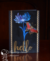
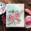
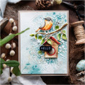
In today's video, I'm taking a first look at the new Tim Holtz Kitsch Flamingo Distress colour. Despite it being a pink colour which wouldn't normally be in my muted palette wheelhouse, I think the pink pops and contrasts nicely with more muted, antique flavoured colours of the rest of the card and that play of one against the other makes for an interesting combination. You can find all the details and video here: