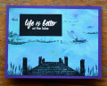
I had this background in my pile and felt it met Karen's Colour Challenge of gorgeous grape, granny apple green and coastal cabana pretty closely. Mostly coastal cabana I admit but the other colours are there if you look really closely. :-) Doesn't help that the light is poor for photography this afternoon. I heat embossed the top layer of the HA layering stamp on the pier. The other bits are masked with scraps of paper. Dockside finally has a dock stamp!
Date: Wednesday, January 6, 2021 GMT Views: 528
Favorited:2
Stamps: Rosewood (Frog Whisker's Ink), B1059, Morning Catch, Hero Arts, CM424, Color Layering Pier at the Lake
Paper: unknown textured paper, matte black scrap, Recollections (purple) CS
Paper Size: A2
Ink: Archival Ink Jet Black and Watering Can, Brushos
Accessories: Your Next Stamp stitched rectangles, blending chalk, white embossing powder, Versamark Watermark ink (for heat embossing) Brushos, white gel pen, fine tipped black marker
Registered: June 3, 2006 Location: In my "She Shed Tornado Shelter" Posts: 4010
Wed, Jan 06, 2021 @ 5:06 PM
Your sentiment is awesome! I totally agree that Life is Better at the Lake, I just happen to live on a small lake and love it so much! Awesome card and design, thank you so much for sharing!