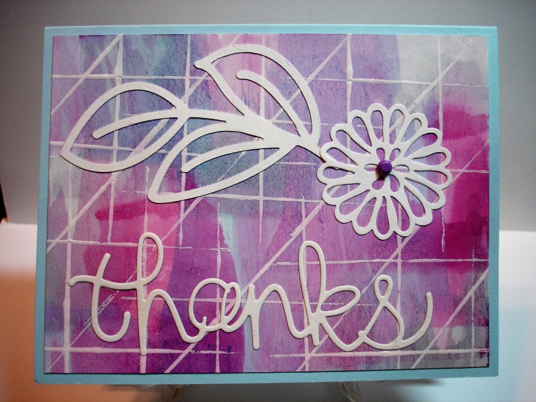
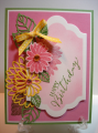
I did a couple of these. I found that I needed to water down the ink quite a bit to not have such bold contrast. I liked the second one I did and used it with the two die cuts!
Date: Monday, May 29, 2017 GMT Views: 1020
Favorited:2
Registered: April 1, 2012 Location: Rogers, AR Posts: 28801
Tue, May 30, 2017 @ 5:00 AM
Wow what an awesome bg you created!!! I love the white lines you put on top of it make it like a grid, very nicely done!!!
------------------------------ Jan 'Being confident of this very thing, that he which hath begun a good work in you will perform it until the day of Jesus Christ'. Philippians 1:6
Splitcoast Dirty Dozen Alumni SCS Gallery Moderator Splitcoast Challenge Hostess Teapot Tuesday TEAm
Registered: July 27, 2007 Location: Dublin, Ireland Posts: 131334
Tue, May 30, 2017 @ 8:49 AM
Pat, this looks fabulous! Gosh, I was afraid I'd watered my ink down too much, but maybe more is the secret. The diagonal white lines were an inspired idea too, so much more interesting than a simple grid effect.
Registered: June 22, 2004 Location: Ontario, Canada Posts: 126331
Tue, May 30, 2017 @ 9:51 AM
another pretty card.
Yes, I found that you may have to vary the amount of water depending on the kind of ink you use.
Thanks so much for playing along with my challenge.