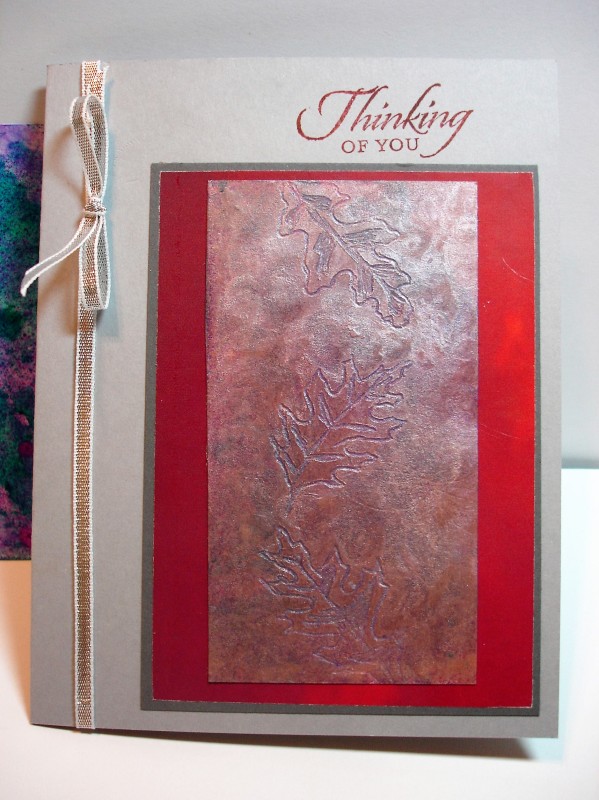
I wanted to try a bright base for the scratch art so I went with a Wrinkle free distress one I had made a while back. (You can see a little strip of it off to the left of the card.) I layered copper gelatos and white over the background. Then I scratched the leaves into it. I was disappointed in the contrast of the scratches. The background did not come through at all. To give it a little more contrast I took a Q-tip and rubbed the gelatos with a swirl pattern and left the leaves smooth. I also sprayed both of my gelato panels with hairspray to seal them so they would not keep rubbing off on my hands.
Date: Saturday, June 11, 2016 GMT Views: 793
Favorited:2
Splitcoast Dirty Dozen Alumni SCS Gallery Moderator Splitcoast Challenge Hostess Teapot Tuesday TEAm
Registered: July 27, 2007 Location: Dublin, Ireland Posts: 131468
Thu, Jun 16, 2016 @ 11:59 PM
Gosh, Pat - the colours and textures in this are beautiful, it looks so shimmery. I know what you mean about the scratches not showing the colour underneath - I had the problem in a couple of places. And I found I kept having to wipe my stylus clean all the time for the best effect.