When it's my turn to pick colors and a dessert option for the Color Challenge, I try to pick something that will stretch our skills, at least a little bit. Well, this week I certainly challenged myself! I am not an artist, can't draw at all, but was intrigued by a
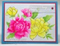
post and video by Kristina Werner, in which she shows no-line watercoloring, and an amazing watercolor technique; and she ends up with a stunning card. I treated myself to the set of watercolors she used, and since I already had the stamp set, I was in business!
I must admit to copying her layout, almost exactly. I used only three colors of paint (as close as I could get to this week's colors), and mixed the turquoise- and saffron-like colors to get the pretty green I used for the leaves. There is a background of very pale blue wash that I created from the same turquoise paint by watering it down a lot!
This was certainly a learning experience for me! The pink peonies came out pretty darned nice, and I am happy with them. But I found that when you start with a light color (yellow), you get very little color gradation. Duh! I was afraid the yellow peonies would photograph as a big blob, so I put the cardstock in my MISTI and re-stamped the outlines right over the watercolored flowers, using a darker color of Distress ink. I think that helped.
I am a little surprised that some of the original stamped lines still show. I expected them to disappear when the watercolors hit them. Don't know why they didn't! Oh, and I intended to paint on the smooth side of the watercolor paper and realized just as I was finishing up that I had painted on the rough side!
Thanks for stopping by, and please play along with us this week!
Registered: April 16, 2008 Location: Meridian, Idaho Posts: 8507
Mon, May 16, 2016 @ 8:27 PM
Barbara I admire how you constantly pursue and use new techniques - and so successfully! This is just a stunning card and you have inspired me to try that technique soon.
------------------------------ Stef
Splitcoast Color Challenge Design Team Splitcoast Dirty Dozen Alumni
Registered: October 30, 2007 Location: Posts: 26718
Mon, May 16, 2016 @ 8:47 PM
This is so lovely, Barbara! The gradations of color on your pink flowers are so pretty and outlining the yellow was a great solution - it provides a nice contrast. Great job!
Registered: November 3, 2005 Location: Fairport Harbor, OH-IO, Lake Erie shoreline Posts: 60040
Tue, May 17, 2016 @ 5:28 AM
You did a beautiful job with your watercoloring. Thanks for the link to the video. I've been wanting to get this stamp set for a while, seems to always be sold out! Fabulous colors,
------------------------------ Karen ~ Thanks for stopping by my gallery. Proud Fan Club Member - FS525, QFTD49 Life is better in a beach town!