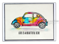
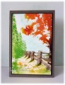
I'm trying to go for a more loose watercolor look this time, it is a work in progress :-) I sponged in the sky first before inking up the stamp, spritzing with water and stamping onto watercolor card. The quality of the watercolor card makes a big difference, I'm sure some is totally fake, I cant get it to work at all! In the bin it goes.
CAS challenge: fall foliage
Color combo: blue, green, red.
Date: Tuesday, November 17, 2015 GMT Views: 1609
Favorited:10
Registered: August 21, 2007 Location: Wayland MA Posts: 105158
Tue, Nov 17, 2015 @ 12:55 PM
This is awesome. Your bold colors really work. This should be framed!
------------------------------ Anne HarmonFS154, QFTD58, PROUD FAN CLUB MEMBER (photo of our Great Granddaughter Elise, just 6 months old) and me, even older.
Registered: March 13, 2012 Location: Southern Florida Posts: 5253
Tue, Nov 17, 2015 @ 2:34 PM
Really lovely! Yes, I agree, the right paper is essential. Whatever you used here, you've come out with a really pretty sun-splashed scene. Great card!
------------------------------ I have come to the conclusion that buying craft supplies and actually using them are two separate hobbies. RachelRose Designs by Robin... GALLERY
Splitcoast Dirty Dozen Creative Crew SU Design Team Alumni
Registered: May 18, 2004 Location: Southwest Michigan Posts: 37078
Tue, Nov 17, 2015 @ 3:33 PM
Oh my, this is just amazing. I am a big fan of those Penny Black images, but it takes a special talent to make them look good IMO ~ you have certainly done that!
------------------------------ Claudia Splitcoast Fan Club Member
Splitcoast Dirty Dozen Splitcoast Challenge Hostess Proud Fan Club Member
Registered: January 27, 2010 Location: Southern Ontario, Canada Posts: 51950
Tue, Nov 17, 2015 @ 5:21 PM
Stunning - just beautiful. I am taking classes and my teacher says only Arches, and I have learned the hard way that there is a good reason for this. Thank you for joining in with the CAS challenge.