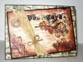
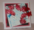
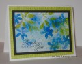
I need several sympathy cards and this is the first today. Todays' colors are real red, primrose petal and turquoise. The dessert is a tag. I had dessert (no surprise).
I stamped the flowers in black and watercolored/inked in the primrose petal...my marker is on the dry side. Next...I added some water with a brush to soften the primrose. Taking my dry real red marker (I am bummed about my dry markers), I added highlights to the flowers and then blended with some water/brush. For the turquoise, I used turquoise brushos and some water and flicked the color on with a toothbrush. I ran this through the dot embossing folder The flower by the tag was done in the same manner and is popped up on dimensionals, as is the tag. Some red organza ribbon that I weathered by heating it and a beautiful turquoise brad along with turquoise rhinestones.
Date: Tuesday, November 10, 2015 GMT Views: 605
Favorited:4
Registered: February 5, 2007 Location: St. Louis, MO Posts: 92546
Tue, Nov 10, 2015 @ 11:50 AM
Absolutely ADORE how you colored your poppies, Pam. A beautiful sympathy card. I believe in the "language of flowers" poppies signify "remembrance".....so they are such an apropos flower for your card.
Registered: June 9, 2006 Location: Wauconda, IL Posts: 55667
Tue, Nov 10, 2015 @ 12:51 PM
This is gorgeous Pambo!! I feel you have used a similar color combo before. You used these colors like they were no challenge at all. I love your flowers and the chunk of organza ribbon is an awesome touch. It gives it that 3D real nature feeling. I like how you used the turquoise as a subtle accent. You did a great job!! I so enjoy seeing your work. :>)