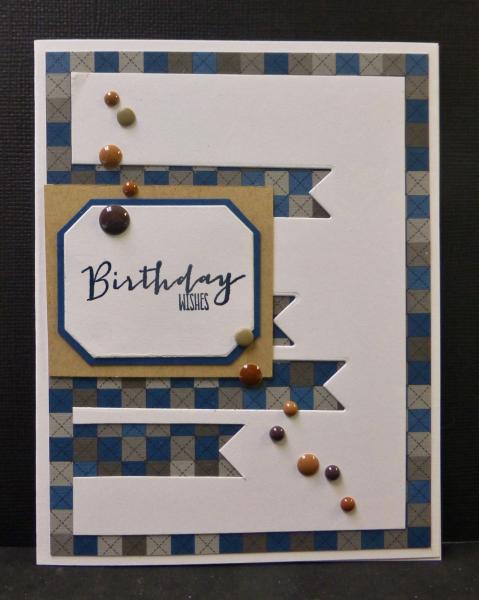
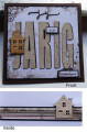
Instead of applying the 5 banners, I die cut them out(one is hidden behind the sentiment plaque) allowing the bg DP to show through. My sentiment panel is rectangular rather than a circle....thought more fitting for a masculine card.
TFL
Date: Tuesday, May 26, 2015 GMT Views: 1491
Favorited:0
Registered: March 9, 2005 Location: OH Posts: 28534
Tue, May 26, 2015 @ 8:22 PM
Sallie, what a great way to add banners on your card! Awesome masculine card.
------------------------------ My Blog- Trusting in the Lord for Everything Proverbs 3:5-6 Trust in the Lord with all your heart and lean not on your own understanding. In all your ways acknowledge Him and He will make your path straight. My Stampin' Up WebsiteMy Gallery, BRAK New Member Mentor. New Grandmother to Mia Lou. 1st Grandchild.
Registered: February 21, 2007 Location: Bay City, MICHIGAN Posts: 17556
Tue, May 26, 2015 @ 9:00 PM
Love how you used the negative of the banners stead of the die cuts! Much more masculine and shows off the great DP with the enamel dots! Very creative, Sallie
------------------------------ SUE aka GREENIE - Twisted Sistah Handmade cards because..No one displays an email on their mantle, or saves a FB post in a box of treasures! Nothing is impossible with God!
Registered: March 31, 2008 Location: Eastlake, OH Posts: 22598
Wed, May 27, 2015 @ 7:07 AM
You not only mastered watercolor, Sallie but also design! What a wonderful idea for a novel layout! Love the masculine designer paper and the negative die cut banners!