This is a second card for the MMTPT533. The first card was addressed, stamped and mailed when I remembered that I did not take a photo. Our cards are going to Starla to let her know how much we care ... these cards are full of hope and concern.
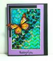
One of the things that I like to do is to look through my gallery for cards that just did not turn out 100% how I wanted, but had to be mailed before I could remake them. The good thing is that I usually have bgs left over from the origional. The first card just needed something, which I decided was lavender. I added a little lavender to the bg I already had using copics. This time I colored the butterfly darker and added lavender. I also used lavender for one of the layers. Here is the first card.blue background monarch by f.schles at Splitcoaststampers
The wings of the butterfly are popped up. I am much happier with this version. TFL, Francie
I will be back tomorrow to finally spend some time enjoying the gallery and commenting.... very busy week ( I say that a lot).
Date: Thursday, May 21, 2015 GMT Views: 1096
Favorited:9
Splitcoast Dirty Dozen Alumni SCS Gallery Moderator Splitcoast Challenge Hostess Teapot Tuesday TEAm
Registered: July 27, 2007 Location: Dublin, Ireland Posts: 131334
Thu, May 21, 2015 @ 5:57 AM
I'd have been pretty happy to have made the first card! But the lavender base certainly does really make the blues and greens really pop. I love the contrast of the black foliage against those colours -so effective.
Registered: December 15, 2011 Location: Abilene TX Posts: 11275
Thu, May 21, 2015 @ 6:59 AM
I truly liked the first card, but you were right about the addition of lavender - it's amazing how much difference it made! The butterfly is GORGEOUS!
------------------------------ JodyLynn - "Love me - love my cats!" DTGD12, DTGD14, HYCCT12, HYCCT13, HYCCT14, HYCCT15, Love Fest 2013, Love Fest 2014 CAS and CC guest designer QFTD 258
Registered: August 15, 2007 Location: Twin Cities MN Posts: 50357
Thu, May 21, 2015 @ 9:27 AM
I think both cards are so beautiful..they look like stained glass. The lavender on this one does really make the design pop. This will certainly briing some comfort to Starla.
Registered: March 31, 2008 Location: Eastlake, OH Posts: 22598
Thu, May 21, 2015 @ 5:14 PM
Jaw dropping GORGEOUS! Love the lavender on the butterfly as well as the bold coloring! Love the way you combine colors for such a beautiful effect! Both cards are fantastic, Francie!
Registered: February 21, 2007 Location: Bay City, MICHIGAN Posts: 17556
Sat, May 23, 2015 @ 5:54 PM
My deepest thanks for sending this to Starla in the loss of her son (my grandson) in a recent car accident. The image is one of comfort and your words will help her heal. THANK YOU!
------------------------------ SUE aka GREENIE - Twisted Sistah Handmade cards because..No one displays an email on their mantle, or saves a FB post in a box of treasures! Nothing is impossible with God!