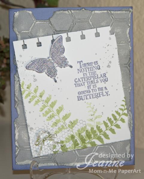
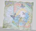
This card was a real departure for me, but I wanted to try a distressed look card. I ended up sanding the background so much the cardstock started to rip and some of it also fell away! I also had an ink smudge on the top layer but decided that only added to the look.
Hard to see in the photo, but the butterfly is covered in dazzling details glitter and it has three rhinestones for the body. I also placed a slightly larger rhinestone next to the two clear buttons.
I inked the edges of both layers and the butterfly to add definition and extra color. This color combo is beautiful but very monochromatic so I wanted to add a little depth by darkening edges. The dessert option (green) also helped.
Date: Sunday, March 22, 2015 GMT Views: 1057
Favorited:4
Registered: January 20, 2010 Location: Brampton, Ontario Posts: 26119
Sun, Mar 22, 2015 @ 2:04 PM
Lovely sentiment! Your ferns are perfect with the butterfly and they both work really well with the sentiment. I think the missing bit of sanded background looks fantastic. TFS
This was a departure for you? Well, you sure did a great job! I like how you used the CS falling away and the ink smudge to your advantage. I am not a big fan of Wisteria Wonder, but the way you pulled together the elements and colors for this card - well, I just might pull out some Wisteria Wonder CS and see what I can do with it. Very nice card.