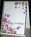
This is for the CC522 - White, Smoky Slate and Wisteria Wonder. Dessert is to add some green. I don't have the gray or wisteria colors so I used the Colorbox Wisteria chalk ink for the flowers and it doesn't look like the right color.
Date: Monday, March 16, 2015 GMT Views: 1732
Favorited:6
Registered: January 27, 2010 Location: New Zealand Posts: 4621
Tue, Mar 17, 2015 @ 1:11 AM
This is a very lovely card. I like how you have the flowers coming from the top corner of the card as well as the bottom. Cute butterflies too!
Stephanie
------------------------------ To live a creative life, we must lose our fear of being wrong. Joseph Chilton Pearce my gallery
Registered: January 20, 2010 Location: Brampton, Ontario Posts: 26123
Tue, Mar 17, 2015 @ 5:00 AM
Your colours are so cheerful! Those flowers look like they are waving in the summer breeze. Love the little butterfly and the font of your sentiment. Sweet card!
Splitcoast Dirty Dozen Creative Crew SU Design Team Alumni
Registered: May 18, 2004 Location: Southwest Michigan Posts: 36980
Tue, Mar 17, 2015 @ 9:09 AM
This is lovely - I do so love the placement of your breezy flowers on this layout! BTW, I have seen the name wisteria applied to so many different hues, I have no real idea what the flowers actually look like!
------------------------------ Claudia Splitcoast Fan Club Member