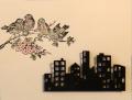
I used birds and buildings but changed most everything else. The cityscape is popped up to show distance and depth, and the birds on the branch are colored with colored pencils. CS color is a bit off in the picture. It's ivory and looks better IRL. Thanks for looking.
Date: Monday, March 16, 2015 GMT Views: 601
Favorited:4
Registered: March 31, 2008 Location: Eastlake, OH Posts: 22598
Mon, Mar 16, 2015 @ 7:56 PM
Love that bird branch combined with your cityscape! I also love the clean look of this card along with the soft colors you used on the bird and branch!
Registered: August 14, 2007 Location: Beautiful British Columbia Posts: 30863
Wed, Mar 18, 2015 @ 8:41 AM
Carol.....this is brilliant.....I never get tired of your creativity....it looks like a photograph that a very creative photographer would take.....love it.....into my faves!!
------------------------------
Jo
Proud Fan Club Member
...sure it�s got a catchy beat, but can you stamp to it?
life is something that happens only when you run out of cardstock