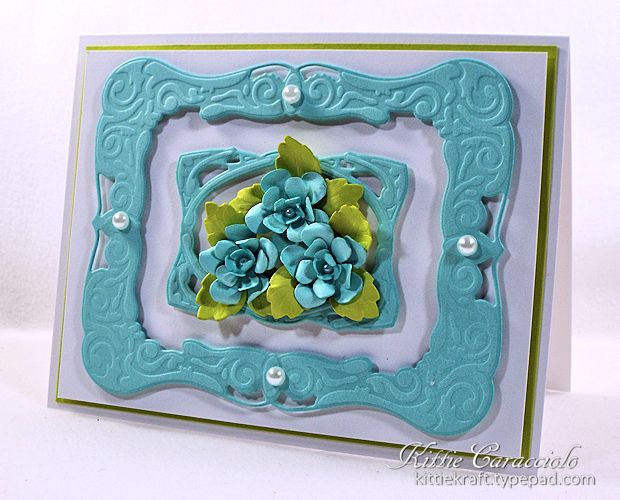
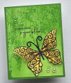
This is for IC473 and Perfect Palette is our inspiration site. For some reason I decided after looking long and hard to challenge myself to use the chartreuse green, tiffany blue and white. Did I say challenge? I really mean torture. I kept thinking that I would rather die than use that color for leaves but I just made myself keep going. I guess it is really good for us go make ourselves jump out of our color comfort zone sometimes but I must say this caused me stress. LOL! Anyway, I almost didn't post it. On top of chartreuse being a terribly hard color to design with the card was very difficult to photograph. The white paper kept looking cream colored. Ugh! Let me just say that I won't be using this shade of green again for a while. Maybe on an Easter project in the spring. LOL!
Registered: June 4, 2009 Location: Deatsville, Alabama Posts: 82050
Sat, Dec 27, 2014 @ 7:32 AM
Super pretty - love the colors!!! This is a total work of art my friend. Hugz
------------------------------ Nancy Williams - Hope your day is Spirit-filled and ink-filled (in that order)!DRS Designs-DT, Punchkateerforever, Dirty Dozen Alumni
Registered: November 7, 2006 Location: Willamette Valley Oregon Posts: 34500
Sat, Dec 27, 2014 @ 1:57 PM
(((((Hugs))))), but to these chartreuse loving eyes, I think the combination is gorgeous, Kittie! You have the perfect balance of blue to that springy green. Stress no mo!!! Wink, wink.
------------------------------ Susan~~~One4Joydaily I'm a FAN CLUB member, U? MY GALLERYof visual Delights MY BLOG