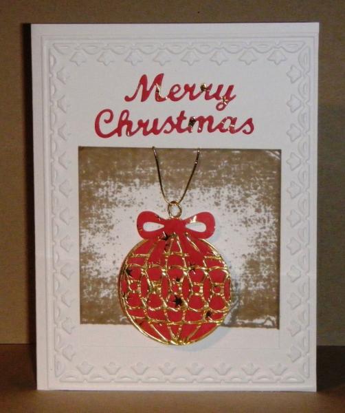
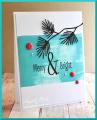
Janeen has chosen a fun challenge this week using the Direct To Paper technique. I use this technique quite a lot. On this card I just pressed the ink pad onto the c/s and really like the end result for the bg to my Christmas ornament. I used some red star dp with a gold overlay for the ornament and die cut the sentiment and bow using the red star dp.
On looking at the card, now that I have uploaded it, I see that I need to straighten the word, Christmas - that's what I get for enjoying a glass of red wine while making a card!!! It is after 6.00pm after all!!!
TFL!
Date: Sunday, November 9, 2014 GMT Views: 1668
Favorited:5
Splitcoast Dirty Dozen Alumni Proud Fan Club Member Splitcoast Challenge Hostess Teapot Tuesday TEAm
Registered: April 18, 2011 Location: Melbourne, Aus Posts: 51844
Mon, Nov 10, 2014 @ 2:24 AM
LOL, I have had two glasses of red wine, it looks straight to me!! Seriously though, this is absolutely gorgeous. I love the colours and the way the ornament sits below the square. Love it all Sue.
------------------------------ Susie
Please don't take your organs to heaven - heaven knows we need them here.
Registered: May 1, 2008 Location: Beautiful Wisconsin Posts: 12483
Mon, Nov 10, 2014 @ 6:14 AM
LOL, i didn't notice the sentiment was off either, i was so enjoying the distressed look of that pressed ink pad. Love how it didn't cover the entire square when you pressed it for a wonderful vintagy feel.
------------------------------ a little bit of this and that there is no thrill quite like doing something you didn't know you could.
Registered: June 29, 2004 Location: Sugar Land. Texas Posts: 79523
Mon, Nov 10, 2014 @ 6:54 AM
Love it. Looks straight to me. I figure my imperfections on my cards (and there are always a few) just prove to those who get them that they are handmade!!! Besides, it teaches others that the world is not perfect, so get over it. LOL
------------------------------ LizThe joy of the LORD is my strength.Right Brain Madness --My blogProud member of the redDivasKSS certified multi-step stamperFan Club member since 2004
Registered: January 20, 2010 Location: Brampton, Ontario Posts: 26123
Mon, Nov 10, 2014 @ 7:02 AM
My die cut words are always on a slant! I thought they were supposed to go that way. :-) Love your wonderful brown and red colour combination. Looks more soothing and peaceful than the traditional red and green. I too like that the ornament goes below the square. Great card!