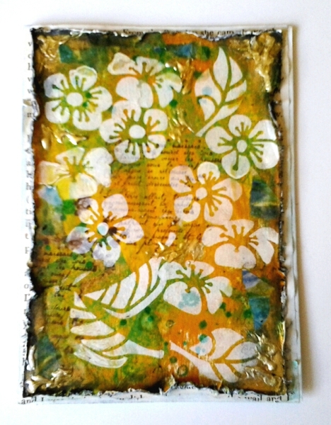
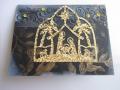
This is one of those cards that I don't know if it is weird in a good way or weird on it's way to the trash. But, I posted it anyway...I am putting it in my stash in case I need a card for someone with unusual taste. The black distressed edges are for the WT504 to use a bon fire image or a "fire technique". I put a thin layer of gesso on my cardstock then used the direct to paper technique to add inks. I added a little gelato in a few areas to deepen the color. I stenciled the flowers with white pigment ink and stamped the words and grunge stamps with dark brown. I destressed the edges and sponged with black. Then I smeared a little inca gold in the corners because they were too dark. I covered an A2 card with a book page then adhered my design. TFL, Francie
Date: Friday, November 7, 2014 GMT Views: 1337
Favorited:3
Registered: March 31, 2008 Location: Eastlake, OH Posts: 22598
Fri, Nov 07, 2014 @ 8:46 PM
WOW Francie! Trash, NO WAY! Geez, this is fantastic and perfect for anyone, any occasion! I agree with Robin too. I can't wrap my head around your process. It's brilliant!
Registered: June 10, 2011 Location: Canberra, Australia Posts: 7376
Fri, Nov 07, 2014 @ 10:03 PM
This card reminds me of Indonesian batik material - it would be perfect wearing as a sarong - amongst the palm trees while sipping on an "adult beverage". Definitely not trash - its a treasure.
Splitcoast Dirty Dozen Alumni Proud Fan Club Member Splitcoast Challenge Hostess Teapot Tuesday TEAm
Registered: April 18, 2011 Location: Melbourne, Aus Posts: 51844
Sat, Nov 08, 2014 @ 1:45 AM
Helen took the words right out of my mouth. I immediately thought of a beautiful Bali sarong. This is fantastic Francie, I love it!! This is weirdo arty stuff at its best my friend. You constantly inspire me with your art.
------------------------------ Susie
Please don't take your organs to heaven - heaven knows we need them here.
Registered: August 15, 2007 Location: Twin Cities MN Posts: 50671
Sat, Nov 08, 2014 @ 5:54 AM
Yes I agree it has a batik look to it. I love the gold in the corners and the intensified colors as a bg for your white stenciled flowers. I had to laugh when you said you were saving this for someone with "unusual taste"....I have a few of those in my stash as well. Lovely mixed media card!
Registered: July 23, 2007 Location: Syracuse, Indiana Posts: 25177
Sat, Nov 08, 2014 @ 8:30 AM
Beautiful layering of colors and I'm with the others in being reminded of Batijk. Definitely a keeper in my book, but maybe I'm one of "those people!" ;)
Splitcoast Dirty Dozen Alumni SCS Gallery Moderator Splitcoast Challenge Hostess Teapot Tuesday TEAm
Registered: July 27, 2007 Location: Dublin, Ireland Posts: 132005
Sat, Nov 08, 2014 @ 10:03 AM
What an amazing effect, Francie! The main layer almost has a transparent look to it, with the white flowers floating above it. I'm still trying to figure it out!! Your burnt edges look great too .
Registered: February 9, 2010 Location: Mentone, California Posts: 7361
Sat, Nov 08, 2014 @ 10:41 AM
Francie, you NEVER disappoint! Your mixed media piece is so wonderfully crafted...I agree that top layer does look as if it has depth and you are gazing down into the script writing with the flowers "floating" above. Love the touches of blue for contrast and the gold on the corners ROCKS! I won't even try to wrap my head around your process...I am just going with "loving to look at it"...AND admiring your incredible talent for this type of technique.
Registered: September 3, 2007 Location: native Texan living in extreme N. GA Posts: 73398
Sat, Nov 08, 2014 @ 11:11 AM
This is so pretty and so colorful, Francie! Love all the techniques you incorporated into this beauty.
p.s. I LOVE plumerias! We have 2, one huge the other a small offshoot of the big one. We just brought them in for the winter. We've had the big one since the late 80's. :0


 .
.