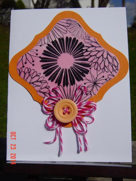
I previously uploaded this card here. The more I looked at it, the more I didn't like it on the Regal Rose base. I replaced it with a GP White base. I'm happy with it now. I think the white allows the orange/pink combo to pop.
Thanks for taking a 2nd look.
Date: Thursday, October 23, 2014 GMT Views: 456
Favorited:2
Registered: December 8, 2005 Location: Iowa Posts: 72952
Fri, Oct 24, 2014 @ 7:33 AM
Fantastic! I love the orange and pink on the white! And awesome job with technique! That image is so striking against the pinks.
------------------------------ Paula "The way I see it, every life is a pile of good things and bad things. The good things don’t always soften the bad things, but vice versa the bad things don’t always spoil the good things, or make them unimportant. - The Eleventh Doctor
Registered: April 25, 2005 Location: Billings, MT Posts: 3675
Tue, Oct 28, 2014 @ 7:43 PM
Well, I happened to like your other version too! Isn't it funny how we create a card, take the photo, think about it, only to rip it apart and try again? You have no idea how many times I've done that in my stamping room!!! Like I said, I LOVE both! ;-) Thank you so much for joining in the HYCCT fun with my challenge!