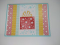
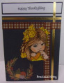
I didn't have glossy paper but the Bristol WC is so smooth I decided to give it a try. This panel is from my second "dip" into my waterdowned ink splots. Tthe shimmer from the Gold Dust Splash (mixed in with my pinks and oranges) is glorious and it's highlighted by the gold trim from the marker. I split up this sentiment by using washi tape but it's my favorite from Amuse Studio's Oct Breast Cancer awareness set.
Date: Monday, October 20, 2014 GMT Views: 948
Favorited:2
Registered: February 26, 2007 Location: On SCS Posts: 36593
Mon, Oct 20, 2014 @ 12:15 PM
wow...another beauty! love the gold trim!
------------------------------ Kim in Illinois, Dirty Dozen Alum, QFTD#207, FS798, VSN Moderator "Famous Last Words" Spring Virtual Stamp Night, April 19 & 20
Registered: February 5, 2007 Location: St. Louis, MO Posts: 92341
Mon, Oct 20, 2014 @ 1:12 PM
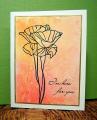
Both of your cards are lovely, Chris, but this is my favorite. I like how the colors ombre from top to bottom. The simple poppy image lets your beautiful bg be more than a bg....if that makes sense. : )
Registered: July 9, 2008 Location: Stars Fell on Alabama Posts: 74568
Mon, Oct 20, 2014 @ 1:30 PM
A very pretty card full of wonderful colors.
------------------------------ My Blog---My Gallery---My PinterestI'm a Punchkateer! (Prez) FOREVERDirty Dozen Alumni2014 CAS Spring DT--- Inspiration Challenge Co- Hostess 12/02/17-12/28/19 Watercolor Wednesday Design Team Hebrews 13:2Brenda
Registered: April 25, 2005 Location: Billings, MT Posts: 3675
Mon, Oct 20, 2014 @ 7:43 PM
Well, I happen to think this technique is JUST as lovely on watercolor paper! Love the splatter effect and water droplets -- just creates such a cool effect! Love your stamp and sentiment too! It has a real graphic feel! Thanks so much for joining me in the challenge! :-)