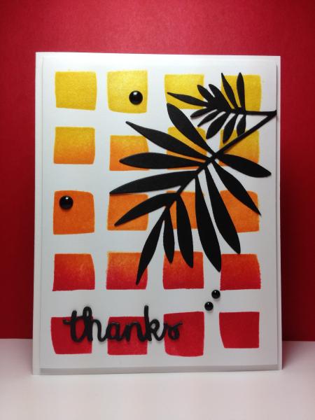
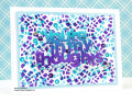
I taped the HA stencil down on my cs and blended the distress inks in an ombre pattern, overlapping the 3 colors. Before removing stencil I sprayed that panel with shimmer spritz. It's always very hard to see in the photo, but it really shimmers IRL. Die cut the palm fancy branch but snipped off part so that it didn't overpower the colors. Die cut and stacked 3 of the word thanks for depth (love how much that adds), adhered the palm die, added dots and mounted main panel with dimensional tape onto the card front. Linking to CAS286 (stencils) and WT493 (spritz it or spray it), also:
Registered: March 31, 2008 Location: Eastlake, OH Posts: 22598
Thu, Aug 21, 2014 @ 9:42 PM
How I love the gradient using your stencil! This just leaps out of the gallery when I opened the first page! I love the use of a black die cut on the bright, happy colors! Your work is a delight to see in the gallery!
Registered: January 20, 2010 Location: Brampton, Ontario Posts: 26117
Fri, Aug 22, 2014 @ 8:21 AM
I agree with Nancy! This card really stands out in the gallery! Love the hot colours and the branch silhouetted against them. Has a wonderful tropical feel that I am enjoying given our cooler summer this year! :-)