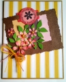
The colors are from the SC492 to use so saffron, chocolate chip, and pretty in pink. The layout is the SC502, and the card is being sent to Audry, who is recovering from a bad fall. After my last 2 cards which were marathon coloring cards, this was supposed to be quick and easy. I love the color challenges since they encourage me to step out of my comfort zone and try something new. Well,I stepped out of my comfort zone into a wasteland without creativity. These are such pretty colors and I could not get anything to work. I also had limited paper in these colors. I ended up stamping the flowers and round tag on white cardstock and coloring them with copics. Any way, this card is going in the mail to cheer up Audery. TFL, FRANCIE
Date: Thursday, August 21, 2014 GMT Views: 781
Favorited:2
Splitcoast Dirty Dozen Alumni SCS Gallery Moderator Splitcoast Challenge Hostess Teapot Tuesday TEAm
Registered: July 27, 2007 Location: Dublin, Ireland Posts: 131738
Thu, Aug 21, 2014 @ 12:08 PM
LOL, colour challenges just freeze me in my tracks. If I have to do them, my way round was to realise that it didn't have to be a whole lot of the colours!!
I love the way you made that sentiment into a sort of slider! The striped background adds a real garden-party feel, I'm thinking a canvas marquee or even some chairs for us all to sit in. And your spray of flowers is very pretty.
Mine, too, was meant to be a quick card and turned out to be anything but. But when they bring such pleasure where they go, it's worth it!
Registered: August 15, 2007 Location: Twin Cities MN Posts: 50576
Thu, Aug 21, 2014 @ 12:55 PM
I think the yellow and white striped bg is so happy...the colors just draw one into the lovely famed bouquet. A pretty card to bring cheer to Audrey! I like doing the color challenges too cuz they make me stretch and I discover new combos that I never would have considered.
Registered: March 20, 2008 Location: Hamilton, Ontario Canada Posts: 615
Thu, Aug 21, 2014 @ 3:51 PM
Francie, you may have been way out of your comfort zone, but the appearances are just the opposite. I was drawn in to the bright stripes first, and I absolutely LOVE your gorgeous flowers, love the way you've shaded them so delicately but yet they are bright. This is GORGEOUS!!!
I have yet to try challenges, I hope to start some soon--so I look up to you and your ability to really knock a color challenge right out of the park--WONDERFUL card!!! Your friend will be blown away, I know I am!!!
Registered: March 31, 2008 Location: Eastlake, OH Posts: 22598
Thu, Aug 21, 2014 @ 7:15 PM
Congratulations on THREE challenges while I am challenged with just one! I love the unique design you created on this and love the way you attached that cool tag! You came up with a fantastic, cheerful design for Audrey too!
Splitcoast Dirty Dozen Splitcoast Challenge Hostess Proud Fan Club Member
Registered: September 24, 2007 Location: WA Posts: 13943
Thu, Aug 21, 2014 @ 7:35 PM
I think you did great with this week's colors. I actually love seeing colors on white cardstock, just as you've used. It gives a lovely contrast. I love the texture on your frame, and the way you've incorporated both this week's colors and this week's sketch challenge. A lovely card! Thanks for playing in this week's Color Challenge.
------------------------------ Barbara Splitcoast Dirty Dozen My website: Inky Fun SCS Fan Club Member Color Challenge Team Member QFTD215