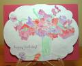
I've been playing around with my watercolour paints to try and get better at using them.
In the past, I've always stamped the image with a dark ink as I did here but I've seen some stampers do images where they stamp in a very pale colour or even Versamark and then paint the image so that there is no outline.
So I decided to do two of the same card - one each way. This one has the image stamped in very pale grey so it scarcely shows. It gives the result of looking more like a freehand watercolour painting that a trained artist would be able to do (but I never could!). But I found it very fiddly to do and I don't think I like the results as much.
Registered: July 28, 2008 Location: Cary, North Carolina Posts: 8728
Sat, Aug 16, 2014 @ 10:05 AM
I really like this one best! I would have had a hard time leaving it without trying to draw distinction between the flowers, but the finished product is beautiful!
Registered: January 20, 2011 Location: Beautiful British Columbia Posts: 7619
Sat, Aug 16, 2014 @ 10:27 AM
Both version are really lovely Susan ... but I love this one best ... it looks more like a true watercolor painting. I do miss growing Sweet Peas ... just not enough sun in our backyard any more. Their sweet smell is one of the memories of summer for me.
Registered: April 16, 2008 Location: Meridian, Idaho Posts: 8507
Sun, Aug 17, 2014 @ 11:06 PM
A great experiment, thanks for sharing with all of us. I do like this version, because it reminds me of impressionist watercoloring. Great fun, thank you for sharing - both are equally beautiful.
------------------------------ Stef
Splitcoast Color Challenge Design Team Splitcoast Dirty Dozen Alumni