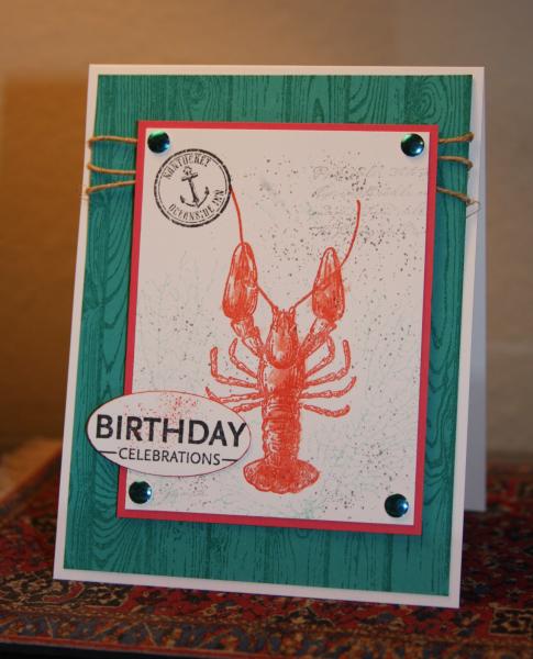
Well, this is design number 2 for this challenge. Last night's effort got thrown in the trash. I'm much happier with this creation. I thought this color worked well for the lobster and I stamped off for the Pool Party on the coral. I did go back and swish a little watercolor in CC on the lobster after stamping in Calypso C. The background is Bermuda Bay on Bermuda Bay cs.
I think this will make a good summer birthday card. Thanks for viewing and commenting.
Date: Tuesday, July 29, 2014 GMT Views: 3276
Favorited:11
Registered: February 5, 2007 Location: St. Louis, MO Posts: 92357
Thu, Jul 31, 2014 @ 8:02 AM
Great card with the chosen colors, Kathy...and any lobster lover would be pleased to receive it. The wood plank bg goes so well with the feeling...like a "lobster shack" where eating is GOOD.
Registered: February 22, 2012 Location: Cape Cod Posts: 43340
Thu, Jul 31, 2014 @ 8:50 AM
This is super! I love the design in these colors. I live on Cape Cod and nautical/ocean motifs are everywhere her, but most especially whales and lobsters. There are so many charming Inns on Nantucket. Pinned and fav'd.
------------------------------ Priscilla (aka - PJ)
QFTD187 My Gallery
Registered: February 26, 2007 Location: On SCS Posts: 36619
Mon, Aug 04, 2014 @ 8:22 AM
Perfect card for these colors! (And I don't even like lobster! LOL)
------------------------------ Kim in Illinois, Dirty Dozen Alum, QFTD#207, FS798, VSN Moderator "Famous Last Words" Spring Virtual Stamp Night, April 19 & 20
I love the woodgrain with this set - it's like they were made for each other. Nice combination of elements. I especially like the splatters and rhinestones.