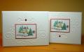
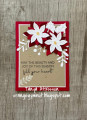
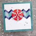
I posted one of these cards on its own yesterday and then did a second one as I was curious as to which way up the embossing folder looked the best.
I want to make a few more of them but can't decide which I prefer. So here are the two of them side by side and I'd love some comments as to which you think looks better!
Many thanks!
Date: Sunday, June 15, 2014 GMT Views: 876
Favorited:6
Registered: January 22, 2006 Location: knoxville tn Posts: 284
Sun, Jun 15, 2014 @ 9:18 AM
Personally, I like the one on the left. For me, having the majority of the embossed design at the bottom draws my eye more to the image in the center. I also like the gem at the top. Both cards are lovely though.
Registered: December 21, 2006 Location: Ireland Posts: 10633
Tue, Jun 17, 2014 @ 1:32 AM
I'd never thought of turning the embossing around! I think the one on the left feels like it could almost be a hanging bauble. The one on the right feels like more like a frame and not anything else, if that makes sense.
Registered: July 28, 2008 Location: Cary, North Carolina Posts: 8728
Tue, Jun 17, 2014 @ 8:11 AM
Although both are beautiful, I think I like the one on the left best. Like the others said, it looks like an ornament like that. I like the red stone at the top best.