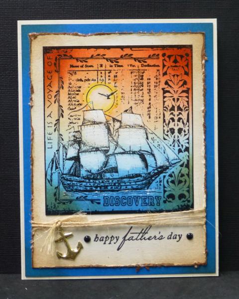
Peggy gave us some bold colors(all from the SU grouping of "Brights") for today's challenge. The colors are:
Pacific Point
Real Red
Pumpkin Pie
Dessert: Enamel Dots. I used 2 small black ones by the sentiment.
When I first saw these colors, I imagined "sunset" with these brights. So I decided that's the way I would go. Masculine cards are not ones that I enjoy making all that much, so I thought that I would use these colors for a Father's Day card(this finishes my needs for this year's holiday.) : ) I used a brayer to create a quick and easy background for the sailing ship using the three inks of Peggy's colors. White acrylic paint was lightly brushed onto the sails to lighten them.
TFL
Date: Monday, April 21, 2014 GMT Views: 2968
Favorited:15
Registered: May 23, 2009 Location: sunny california Posts: 9825
Mon, Apr 21, 2014 @ 7:37 PM
Fantastic card and great image for these colors. The distressed edges and the anchor add so much to the look of your card and the white in the sails really makes them stand out. What a perfect fathers day card. Right into my favs.
Registered: March 31, 2008 Location: Eastlake, OH Posts: 22598
Mon, Apr 21, 2014 @ 7:44 PM
Not only is your use of the colors brilliant but your brayering is outstanding! What a perfect job you did blending these into a perfect sunset on the sea! I LOVE the idea of brightening the sails with white! Another favorite, Sallie!
Registered: December 15, 2011 Location: Abilene TX Posts: 11275
Mon, Apr 21, 2014 @ 8:20 PM
Gorgeous image and the background is amazing! I really need to get better acquainted with my brayer. I love all the added details - the anchor and twine are perfect!
------------------------------ JodyLynn - "Love me - love my cats!" DTGD12, DTGD14, HYCCT12, HYCCT13, HYCCT14, HYCCT15, Love Fest 2013, Love Fest 2014 CAS and CC guest designer QFTD 258
Registered: March 7, 2009 Location: Where the corn is knee high by the 4th of July Posts: 17498
Mon, Apr 21, 2014 @ 9:25 PM
Like your stamped design and the brayered colors look terrific. Using white paint to lighten the sails is a fab idea and it looks good. Love the distressed edges, at first glance I thought they were emb in gold. AWESOME card, Sallie!