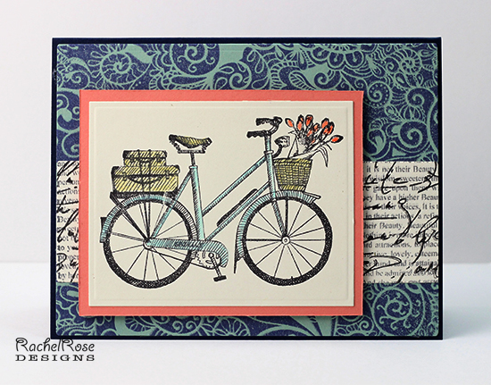
My inspiration was THIS BOOK COVER. I loved the retro colors - navy, pale blue, berry pink and a dark yellow with ivory. My version uses a coral in place of the berry pink because it seemed to work better. I appropriated the bicycle as a focal image and included a strip of type.
Thanks for looking!
Date: Sunday, April 13, 2014 GMT Views: 1644
Favorited:5
Registered: November 4, 2006 Location: Midwest Posts: 24759
Sun, Apr 13, 2014 @ 10:21 AM
Love the embossed frame and the texty *road* behind your bike ... your composition is perfection ... fabulous coloring too ... awesome inspired design.
Registered: November 7, 2006 Location: Willamette Valley Oregon Posts: 34500
Sun, Apr 13, 2014 @ 12:03 PM
absolutely love what you did with your IC this week. Your card has me wanting to be in Tuscany with that bike, a crusty loaf of warm bread, a nice cheese, and sorry wine fans...but an Pacific NW micro brew...oops, I got distracted day dreamin'...love your card!!!
------------------------------ Susan~~~One4Joydaily I'm a FAN CLUB member, U? MY GALLERYof visual Delights MY BLOG
Registered: March 31, 2008 Location: Eastlake, OH Posts: 22598
Sun, Apr 13, 2014 @ 3:41 PM
Robin, I love the background you created for your bike and LOVE that image! The way you did the center panel is fantastic, stamping script over newsprint! What a great take on your inspiration!
Splitcoast Dirty Dozen Alumni SCS Gallery Moderator Splitcoast Challenge Hostess Teapot Tuesday TEAm
Registered: July 27, 2007 Location: Dublin, Ireland Posts: 131364
Mon, Apr 14, 2014 @ 12:52 PM
Thanks for directing my attention to such a fascinating book via your lovely card, Robin. My youngest nephew might still be young enough to enjoy that book, and since my brother did graphic design I know he would!
I really like the muted heritage colours, and love the way you stamped Script on the print. The contrast in scale works wonderfully there.