What a terrific site! And so well organized. This is what I finally chose: http://design-seeds.com/index.php/ho...pring-splashes
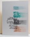
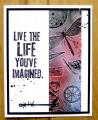
I don't like to obsess over the IC, I like to choose something that speaks to me immediately. This was very much like a color challenge for me, which are the most difficult, so it helped to have the accompanying pictures. Amazing how they pull out all the colors, even some that are very hard to see. I simply dropped alcohol inks on the glossy cs and let them spread and run. I added a few drops of the blending solution to tone it down. In reality, the colors are much deeper than this picture but it's so dark out now, I had to use the flash. So in a way, the colors you see are truer to the inspiration item. I didn't worry a lot about the colors that I chose, just tried to get as close as possible. So it's more in the 'spirit' of the spring splash. If anyone knows who makes this dragonfly, let me know. No name on the woodmounted stamp.
Date: Saturday, January 18, 2014 GMT Views: 1475
Favorited:7
Registered: August 18, 2008 Location: Belfast, Northern Ireland, UK Posts: 31972
Sat, Jan 18, 2014 @ 4:58 PM
Wow, I LOVE this - the splashes of colour are so vibrant, if they're deeper IRL, they must be brilliant! A lovely technique, I'd like to give it a go sometime but don't have enough inks right now!
Registered: March 31, 2008 Location: Eastlake, OH Posts: 22598
Sat, Jan 18, 2014 @ 5:22 PM
Love those color splashes! I haven't tried this technique but love the results. Thanks for the inspiration to try it. Love the sentiment you chose for it too!


 IT'S GORGEOUS!!!!!!!!!!!;)