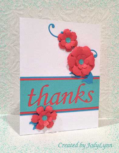
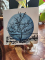
This is my card for the CAS255 challenge, which was a sketch challenge, and for CC461 - Coastal Tempting Cantaloupe. The colors aren't exact, and I would never have put them together, but I love the sketch and the more I look at it, the better I like it.
Pretty self-explanatory - what is hard to tell from the photo are the Stickles added to the flower center and the Sheer Shimmer Sparkle brushed on the flowers and dotting the background.
As always, thanks for looking!
Date: Saturday, January 18, 2014 GMT Views: 1461
Favorited:4
Registered: January 20, 2010 Location: Brampton, Ontario Posts: 26123
Sat, Jan 18, 2014 @ 1:18 PM
I think your negative die cut sentiment is wonderful! Those colours really combine well on that panel. The flowers are beautiful and I bet the sparkle looks great IRL. So pretty!
Registered: March 31, 2008 Location: Eastlake, OH Posts: 22598
Mon, Jan 20, 2014 @ 10:13 PM
I do love the colors together! Color is not my strong suit so this really popped out of the gallery! Love just the hint of glitter for interest without overwhelming your design! Fabulous card!
Registered: May 23, 2003 Location: Ontario, Oregon Posts: 9431
Wed, Jan 22, 2014 @ 7:45 PM
What an eye-popping creation! Dynamite color combo and the negative space with the coral lettering is a real show-stealer. Fun card and one I will use for inspiration. TFS!