I chose this card of Sandie's as my inspiration. FS359 ~ Field Flowers by sistersandie at Splitcoaststampers
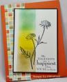
I had been working with Retro Fresh design paper from SU and decided to use some of those colors in the inks. I wanted to include a strip of the paper which had squares on it, so I sponged the colors to be more square like than blended. I changed the base color to tangerine to made the other colors pop. Then I angled the image panel to see more of the designer paper. Clean and Simple is difficult for me. LOL Thanks Sandie for a great sample! Enjoy your week as Queen!
Date: Sunday, January 12, 2014 GMT Views: 1816
Favorited:15
Registered: June 29, 2010 Location: Recently moved to the seaside, with views over to the Isle of Wight Posts: 13703
Sun, Jan 12, 2014 @ 8:01 AM
Thank you SO much for making this card - and in such a funky way! I am having the best time, up in my craft room - wearing a crown (handmade, but who cares!). Thank you too for your helpful and caring comments in the gallery.
Splitcoast Dirty Dozen Splitcoast Challenge Hostess Proud Fan Club Member
Registered: September 24, 2007 Location: WA Posts: 13920
Sun, Jan 12, 2014 @ 8:06 AM
I love this card! It seems that recently, when I pick out a card from the gallery that appeals to me, the artist is YOU! Thank you for always being such an inspiration!
------------------------------ Barbara Splitcoast Dirty Dozen My website: Inky Fun SCS Fan Club Member Color Challenge Team Member QFTD215
Registered: January 20, 2010 Location: Brampton, Ontario Posts: 26123
Sun, Jan 12, 2014 @ 9:57 AM
Love that retro paper! I think I was around when it was fresh for the first time. :-) That orange background panel is the greatest foil for your white image panel. I love the sponging too! TFS
Registered: May 23, 2009 Location: sunny california Posts: 9825
Sun, Jan 12, 2014 @ 6:31 PM
I love how the three colors blend together on the front panel. They look so nice with the flower stamp you used and the sentiment is just perfect. All the parts blend together so nicely.