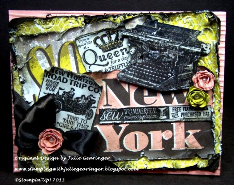
When I saw the PPA178 colors at The Pals Paper Arts this week, I immediately thought of the Soho Subway Designer Series Paper (DSP) and decided to pull out the page that has ┬ōSoho New York┬ö.
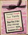
I have found it a bit difficult to figure out what to do with this sheet of DSP, so I decided to create a vintage collage using previously stamped images along with distressing.
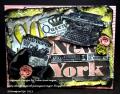
This card was difficult to photograph and looks better IRL- If interested, I have more details and free instructions on My Blog
Thanks again for taking the time to look- have a wonderful Tuesday!!
Date: Tuesday, November 12, 2013 GMT Views: 996
Favorited:4
Splitcoast Dirty Dozen Alumni Creative Crew SU Design Team Alumni
Registered: October 5, 2006 Location: Maryland Posts: 15789
Fri, Nov 15, 2013 @ 3:34 PM
This was a difficult color combo for me- always struggle with yellows and pinks (this was Early Espresso, Summer Starfruit and Crisp Cantaloupe) but was thrilled to find out that it was a PPA Pick for the week!! A busy style for me but really, it does look better in real life- had trouble photographing and had to darken up to show some of the details :-)