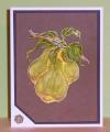
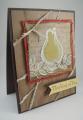
Okay, I had a little trouble with this technique. I stamped in Perfect Medium and used the embossing powder, no problem. But the white ink I used for the white wash, was not archival and would come off when I tried to color with Copics. So I added more white and then used chalk to add color. Lastly I added glossy accents and the hexagon brad.
I enjoyed this technique, but know to get some different white ink for next time. Thanks for taking a peek!
Date: Monday, September 30, 2013 GMT Views: 481
Favorited:3
Splitcoast Dirty Dozen Alumni Favorites Team Notifier Splitcoast Challenge Hostess
Registered: October 26, 2009 Location: Oakhurst, near Yosemite Nat'l Park. Posts: 46802
Mon, Sep 30, 2013 @ 6:27 PM
OMGosh, it is gorgeous!! I love this look, so artistic!! Love your colors too!!! (I think, you can't go wrong with purple!! LOL!) I really like what you did, I can't really describe it...looks like one of the master's surreal type paintings!! LOVE it!
------------------------------ Blessings, Robin Encourage one anotherMy Blog-InkMagination , QFTD201,Dirty Dozen Alumni.Impression Obsession DT, ECraftDesigns DT, Formerly HC DT, ODBD DT, DRS DT
Registered: March 31, 2008 Location: Eastlake, OH Posts: 22598
Mon, Sep 30, 2013 @ 6:52 PM
That is some fabulous shading on your pears! WOW on the coloring! I even love the white speckles, intentional or not- they look like highlights! Beautifully done, Kathleen!
Registered: December 15, 2011 Location: Abilene TX Posts: 11275
Mon, Sep 30, 2013 @ 7:22 PM
It may have given you trouble, but the outcome is fantastic! Love the way leaves look, in particular, and the hexagon brad on the corner where you trimmed back the layers. Great idea!
------------------------------ JodyLynn - "Love me - love my cats!" DTGD12, DTGD14, HYCCT12, HYCCT13, HYCCT14, HYCCT15, Love Fest 2013, Love Fest 2014 CAS and CC guest designer QFTD 258