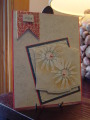
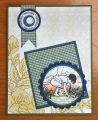
Sometimes I like to combine things that shouldn't go together, like the sketchy daisies and spatters and the more formal baroque patterns of the ef and the design on the wooden banner. At least, that's what I tell myself to feel better about this card. Very painful! The colors were the hardest part, as usual. I probably have calypso coral cs, not sure if this is what I used, but I don't organize my colors very well as far as what they are called. I did have the two correct color markers so those colors are represented in the spatter background and edging around the lower layer. I used two different dies to make the layers more 'custom' and creative (?). I guess I need to buy the calypso coral ink pad, this color keeps popping up.
Date: Thursday, July 25, 2013 GMT Views: 1658
Favorited:3
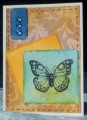
Ink: Versamark, Adirondack peach bellini, SU baha breeze
Accessories: bashful blue and marina mist markers, spritzer tool, two diecuts, vanilla ep, coral half pearls, Little Yellow Bicycle wooden banner, sponge, ef
Registered: December 15, 2011 Location: Abilene TX Posts: 11275
Thu, Jul 25, 2013 @ 8:15 PM
Love this!
------------------------------ JodyLynn - "Love me - love my cats!" DTGD12, DTGD14, HYCCT12, HYCCT13, HYCCT14, HYCCT15, Love Fest 2013, Love Fest 2014 CAS and CC guest designer QFTD 258