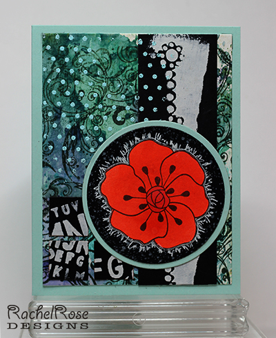
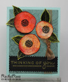
This is for Mixability Challenge 12 - POP Goes Your Color Wheel. I started this with a wrinkle-free distress piece on WC paper in various blue and purple Distress Inks. Then I overstamped it in Versafine Onyx using my Flourishes CAC BG stamp (all Cover A Card BG stamps here from Impression Obsession). I used part of a Crafter's Workshop stencil to create the long vertical piece with white acrylic paint on black card stock(PTI True Black). Then another part of the same stencil to create the letters in more white acrylic, which I then die cut into small squares and glued down in the lower left hand corner. At this point it really needed something in the upper left hand corner, so I Versamarked part of my Dots CAC stamp and then embossed in Powder Zing. The flower - colored in Ripe Persimmon Distress Ink - has been sitting around on my desk since a recent color challenge, a piece that didn't make it onto the final card. I cut it out, then die cut a black circle which I stamped in white pigment ink using my Spatter CAC stamp, glued the flower down and then used a white Signo pen to create some scribbly visual texture around it. Glued that onto a larger Aqua Mist Circle and adhered to base. Card base is also Aqua Mist.
This was one of those cards that I thought I was not going to finish. I had another orange flower I'd made purposely for the POP image and as much as I loved it, it just was not working, no matter what I did. Being willing to put it aside allowed me to look around and find the flower I did use.
Another fun challenge!
Thanks for looking!
Date: Saturday, April 20, 2013 GMT Views: 1031
Favorited:5
Registered: August 15, 2007 Location: Twin Cities MN Posts: 50415
Sat, Apr 20, 2013 @ 10:12 AM
This is fantastic Rachel! Your background with all the different stenciled parts is awesome, so many interesting patterns to explore..it must have been fun to make. And I love that red flower..it was just waiting for this card..isn't it funny how sometimes you have a leftover piece laying around that catches your eye? You really made the most of it by adding the black bg and those little white gen pen lines (they kind of look like tiny hairs!). A SUPER piece of art!!
Registered: December 15, 2011 Location: Abilene TX Posts: 11275
Sat, Apr 20, 2013 @ 10:55 AM
I agree, Rachel, this is awesome! The blue colors look perfect with the black, and you used some gorgeous stamps and stencils. I love the cut-up letters in the corner and the embossed dots. Just an outstanding piece!
------------------------------ JodyLynn - "Love me - love my cats!" DTGD12, DTGD14, HYCCT12, HYCCT13, HYCCT14, HYCCT15, Love Fest 2013, Love Fest 2014 CAS and CC guest designer QFTD 258
Registered: March 15, 2012 Location: Alabama Posts: 11018
Sat, Apr 20, 2013 @ 4:57 PM
Fabulous Rachel!!! Your flower not only looks so cool, it really does POP!!! Awesome idea to use your white pen around the petal edges! Your background is so interesting and I LOVE all the layering!!! You are so fantastic at this technique!!! I say this often, but any card that keeps my eyes moving, is true ART! Yours does that!!!