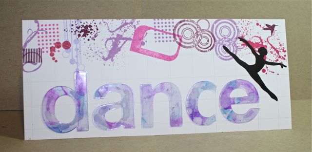
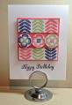
This is my sample for the CAS Spring DT search first challenge! I used alcohol inks to "paint" the clear acetate letters! Super fun! The rest is a collagen look...my DD has since commandeered the card and is looking for a frame to fit it in! Love it!
Hope you have fun with this challenge!
supplies:
paper- PTI white, clear acetate
stamps- PTI grunge me
ink- SU almost amethyst, perfect plum, orchid opulence, melon mambo, pixie pink and assorted alchohol inks
accessories - digital image (dancer), acetate
Date: Thursday, March 14, 2013 GMT Views: 1114
Favorited:4
Registered: May 9, 2007 Location: Wisconsin Posts: 8703
Fri, Mar 15, 2013 @ 11:55 AM
Wow Denise, I never would have thought to paint on acrylic. I guess I thought it would run or not hold the color. I love the soft muted tones you achieved. Cool card. Thanks for the challenge.
------------------------------ Mary ~~ QFTD #152, FS#514CC Guest Design Team 2012, 2013, 2017 & 2022 2014 CAS Spring Design Team MemberSC Guest Design Team 2015 & 2022 SU Consultant "Life's greatest adventure is finding your place in the Circle of Life" - Lion King
Registered: June 9, 2006 Location: Wauconda, IL Posts: 55665
Fri, Mar 15, 2013 @ 3:30 PM
What a beautiful card!! I love all of the pretty colors that you would certainly see in a cosmetic store. I can also see why your daughter wanted this. Nice!! :>)
Splitcoast Dirty Dozen Alumni Creative Crew SU Design Team Alumni
Registered: October 29, 2004 Location: Coos Bay, Oregon Posts: 24007
Sat, Mar 16, 2013 @ 6:35 PM
How sweet that your DD loves her mommy's card too. How creative to color your acdetate letters. Love the collage around the upper edge. All well balanced and colorful. TFS and hosting the CAS spring DT Search Denise.